
Unit 9: Research and analysis of characters (week 2)
Introduction
Within this lesson we looked at the different types of features that are within characters and what they can show about the character’s personality. The things that we looked at were the characters’ appearance, personality, movement, voice and Audience for that specific characters, we looked at this because we are trying to expand our view upon what makes a character through its features and what we can tell about their personalities just by these things. We were given the task to think of two different characters that contrasted one another in either their personalities or appearance.
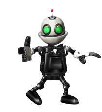
The two characters that I thought of were Lobo from Marvel and XJ-0461 (Clank) from ‘Ratchet and Clank’. I gathered the Information for each of the characters and I compared them to see how and what they both had either in common or their differences.
- Appearance:
Their appearances of both of the characters are extremely different form one another in more ways than one. I’m going to be looking at how they look what makes their characters be seem as who they are to the eye without knowing much if anything about the characters background.
Lobo – Lobo is dressed in all black tethered and torn leather, with huge hiking/biking boots that are covered in spikes and looking rather raged and worn. His hair is thick, black and rough and tuft not really having a look of being clean, pure red eyes that show off that he isn’t a friendly character and scars covering some of his visible skin. His skin is grey toned that shows a sign that he’s not living and that his body is life less or the he isn’t quite from this world. His full physical appearance is menacing and horrifying to the eye which gives the impression that he is evil and means bad intentions.

Lobo carries around a sharp hook on a chain a shot gun and a blow torch all of these items give you the impression that he is a hunter of some sort, a killer or someone who has bad intentions.
Clank – Clank is shown to look rather smooth and fine edged. He’s appearance is that of a humanoid child with feet fingers and the proportion of that of a human. He has green eyes that give the sense that he isn’t a bad character as well as his colours and shape being rather dull and blunt without a lot if any sharp/harmful edges on his being which gives him an approachable appearance.
Differences and similarities
They have a few similarities and differences that divide these characters from one another. One of the main difference that is noticeable is their eyes, Clank has green eyes where Lobo has red eyes which helps the player know whether they’re a good or bad character. Another difference is that the way that they’re both build (Although Clank is a robot) they do have a huge difference in the size and build of their bodies.
Clank has a rather thin, skinny and somewhat fragile to his appearance by having huge hands and feet yet little and thin legs and arms (Which helps him in the games with his abilities). He is also rather smooth looking and well rounded.
Lobo is quite built and stocky to his whole body structure is build off of circle on top of circles which could mean that he isn’t as bad as it seems. However, His body is covered in scars and dark black veins than entail another view on his appearance, as well as having sharp an pointy hair and accessories.
- Personality
Both of their personalities are different too in both the way they sound to the way that they act and speak.
Lobo – Lobos’ personality is ruthless he never gives up on anything that he peruses weather it is hunting or trying to take down his target he never gives up. Reckless (He will destroy anything to complete his goals), Intelligent, egotistical (stating that he’s above all), caring, and helpful (when he looks after Ms tribes).
Clank – Clanks personality doesn’t match all of the other robots that are similar to him. He has a rather humanoid characteristic to him that is both expressed through this motions, emotions that he expresses to others (ratchet, etc.) as well as his actions “he chooses to be a vegetarian”.
- Movement
Lobo – Lobos’ movements are very robotic because of his build; he shifts is body as one turning left to right as he walks barely moving, seemingly waddles because of his build and of his personality plays a part on that too by being egotistical and feeling as he’s the top dog.
Clank – Clanks movement is humanoid which is exactly the same as his appearance and personality, he sways his body from left to right as a normal human would if they were either running or walking as well as the arms moving as he walks which is really similar to a human’s action.
- Voice
Lobo – Lobo has a rather deep and dark voice with a menacing tone that sends shivers through the spine, it shows the musky and damage that his body has been put through. Lobo has a very burly biker voice that can intimidate smaller people, as well as being rather loud obnoxious sounding rather egotistic and sarcastic.
Clank – Clanks voice is proper and sophisticated in the fact that he is really well spoken and easy to understand. This also helps strengthen his personality of being kind, understanding and intelligent. He isn’t sporadic in what he says, he is very straight forward with what he’s saying at any given point.
Differences and similarities
Another difference is the way that they speak Clank has a rather tidy and gentlemanly toned voice that help people associate him with being a good guy and Lobo has a rather groggy and fowl mannered voice which gives off the impression that he isn’t quite the nice guy
- Audience for that specific character
Lobo – Lobo has a rather fierce appearance and an unruly attitude towards everyone and everything. As well as catch phrases that aren’t for the young aged audience , they’re rude and barbaric with a few parts of profanity and not for the young ear. His audience is for young adult and adults.
Clank – Clanks is aimed at more of a kids and teenagers audience possibly borderline middle aged adults also. This is because of the design of clank is very smooth and welcoming looking rather than having sharp and dangerous edges he is well rounded and smooth, as well as his colours being really simplistic and calming rather than harsh colours.
Evaluation:
Researching these two contrasting characters was very interesting to do because I found out what made both of these characters who they are by their appearance, their voice, the personality and their audience that they are meant for. This is going to help me out when thinking about what character I would like to create because finding out what makes a character suitable for a certain audience is really helpful to know when developing my own ideas and developments of my characters designs.
Bibliography:
How lobo acts:
WatchMojo.com (Oct 3, 2013) Supervillain Origins: Lobo. Available at:
Clanks movement: Time 1:43:10
RabidRetrospectGames (Apr 12, 2016) Ratchet and Clank PS4 Gameplay Walkthrough Part 1 FULL GAME – No Commentary Ratchet and Clank 2016. Available at: https://www.youtube.com/watch?v=bso_HL0lhqQ (20/09/2016).
Clank biography:
‘Clank0′ (2006) The Ratchet and Clank Wiki. Available at: http://ratchet.wikia.com/wiki/Clank (Accessed: 21/09/2016).
Lego franchise report (week 2)
Introduction
Within this session I am looking upon the Lego franchise and how they accustom to every possible audience through what they do (Games, Movies, toys, TV series) and through their designs of both characters and story/game play. I will be discussing the differences and similarities to do throughout all of the Lego games.
I will also be looking at a character that they have used within one of their games (preferably a Villon because they are usually more intimidating) and identify the key features that Lego has changed about the character to make him/her suitable for the younger audience as well as the older audience.
Lego Batman 3: beyond Gotham
The 3rd Lego Batman game is based for the age group of 7+ because of the art style and the comedic references that are throughout the game play as well as the overall softness of all of the characters and the overall feel of their appearance. The age range has kept the same throughout the whole franchise 7+ this is because the contents has all stayed relevant to that of the movies that it is based around ‘Batman’. Batman is naturally scary and is in nothing but action movies that have a lot of violence within them and the Lego games have changed the horror within the movies into something of somewhat comedy for both for younger audience as well as the older audience as well.
The reason why it is kept at 7+ is because the game does have mild/high violence and sadistic actions within it and it tries to soften horrific events that are within the films for the younger audience as well as appeasing to the older audience as a wacky addition to the games. For example: when the characters die instead of blood they simply fall to peaces and when there is a scary character or enemy they tend to have funny interactions that add to the whole comedic side of things.
As well as this they have slapstick comedy within most parts of their games by making the younger and older audience laugh to violence within the game because it have been censored and adapted for more comedic reasons, as well as being aimed at a younger audience.
Within Lego Batman 3: Beyond Gotham throughout the whole franchise of the Batman series the overall look of the characters hasn’t changes an awful lot because they are the same characters so a lot of the props and the textures of the characters are going to be the exact same as the first Lego Batman as it is within the third game. As well as having the exact same props as the original games there are lots of differences to do with the characters, this being their colours have changed to become darker or lighter depending on who they are (for example: Batman has become darker and man-bat has now got white hair on his chest and ears) as well as small features within the characters.
They have kept all of the bright colours that they have had since their first game ‘Lego Island’ and they have kept this all the way to their newest game ‘Batman: beyond Gotham’. This has kept in rather simplistic for the younger audience that it is originally aimed for with still a hint of being for adults as well, especially within the newer games where they have added more puzzle type scenarios that sometime test your memory and coordination. As well as this (mentioned earlier) they has still kept the violence within the game just transferred this to a timid and less gory transaction when the character gets killed.
They have also changed the way that everything looks (i.e. the bricks and some of the characters appearance) to a smoother yet sharper to the eye and just generally more symmetrical and naturalistic. For the characters they have done the same over all changes as well as changing what they look like within the slightest (As mentioned earlier)
Character analysis
The character that I have chosen from the Lego games is Doomsday and the reason why I have chosen Doomsday is because of his overall appearance within the movies and animated series is rather menacing and scary and not very suitable for younger audiences. So in order to make his appeasing for both older and younger audiences Lego have changed him and an awful lot so he can appeal to the younger audience as well as the older audience.
Here I have gathered the different appearances of doomsday form different types of media the bottom one is from the new movie ‘Batman vs Superman’ just after Doomsday has broken free form his chrysalis and causing havoc on the city of Gotham. As you can see he is covered with bumps and sharp edges, the sheer size of dooms day within this movie as well is monstrous as he towers well over 15ft. This makes him really menacing and scary to a younger audience.
In this image it shows a 3D model of Doomsday and as you can see it is far scarier than the one from the movie mainly because of the sheer size of his physique as well as the size of his spikes gives him a more dangerous look and that he’s more suitable for the older audience because of his overall look.
The third image is off of Doomsday within the game Batman 3: Beyond Gotham. As you can see there are rather drastic changes with the character for this game and this is because of the appearance of Doomsday to begin with, before he was a character within the Lego universe he has very sharp edges dark menacing colours and all round he looks scary. For the Lego game they have changed practically everything to do with him; firstly they have changed his colours to a cool and calming blue instead of having a gritty and bleak brown.
Another thing that they have done is they have had sure that the over all look of his spikes and shape by changing them from being rather ridged and sharp and they have changed then to a smoother and blunt edges that look less intimidating and well as making then less ridged and harsh which makes him not as intimidating and menacing as he does within the movie and within the other game.


Evaluation:
Throughout this task I have found out that there is a lot of difference between a characters design through different types of media, whether it be a Lego character, an animated character for a fighting game or within a movie. I found it rather interesting to see the development of the characters and what has changed throughout the different types of media.
This is going to help me with my own characters design in the future by helping me understand the key differences between a fighting game (street fighter~) and a Lego game (Batman: Beyond Gotham) as see what will change my character from looking really realistic to looking plastic and like a Lego character.
Raul, O. (2016) 11:14 PM – 30 Jun 2016. Available at: https://twitter.com/vics95836264/status/748761720592539648 (Accessed: 27/09/2016).
Lego Doomsday: http://lego.wikia.com/wiki/Doomsday
Batman vs Superman Doomsday: http://www.techinsider.io/batman-v-superman-who-is-doomsday-2015-12
Re-creation of a character to suit another audience (week 2)
Introduction
Within this Session I am going to be discussing a character that I have chosen for the two I had last week that contrasted from one another and what they as a character show towards their audience this being their age range, what gender they are specified for, their background and how this shows the audience they are meant for. The two character that I am going to be choosing from are Clank from ‘Ratchet and Clank’ and Lobo from ‘injustice’.
Also I am going to be re-designing the character to fit a different audience all together and change these specifications to the new design and to the new audience that I have chosen.
Chosen character: Clank (Ratchet and Clank series) 7+
Audience:
Age range – Clanks age range looks around the age of teenagers to young adults (7-15) this is because the overall look of clank is very approachable towards the audience, he doesn’t have any sharp edges so he isn’t perceived as a dangerous or menacing character because of the way that his body is shaped and the colours that are used for Clank. His voice and attitude is also very calming and sophisticated in the choice of words and attitude.
I am looking at trying to make him suitable for an older audience more of a 15-18 years of age possibly older audience as well.
Gender – The gender that I think clank is for is both genders because of the overall look and attitude of clank it isn’t aimed towards a specific gender (colours are neutral meaning there are no blues or pinks that would make him more in favour of one specific gender.)
I am thinking of changing this by making him more appealing to the male eye by being harsh and sharp edged and dark colours. However, either keeping his personality as it is or making him more heart felt and caring than the original clank.
Background – Clanks background is rather simple, he was a robot that was designed to be a super destructive killing machine but he went rouge because of this ancient soul was put inside of him which makes him rebel against his higher authority. This could be related to the younger teenagers because they are a little rebellious to their higher authorities as well which could entail with this. As well as this he is a secret agent within an action movie which could interest the more of the younger aged audience because most children at a young age think about being a detective of some sort as well as a trending feature in some older audience members.
Re-designing:
To re-design Clank for a different audience I wold start by changing his overall colours to a more darker tone to give him a scarier look because of the darker colours and making sure that some of his coloured features are more menacing then they were before I.e. his eyes from green to a possible red or orange. Another thing that would help change Clank for the older audience is to change his appearance to a great extent by making his edges sharper and harsher so that it fits to a more spookier manner and helping the fact that he is based for the older audiences.
(add drawn sketches of new design ideas and talk about re-design)
Making him all hard and sharp edges will give Clank a rather sinister look to him as well as the accompanying colours that I wish to add to him.
Age range – The new age range that Clank is going to be is 15 because of his destructive nature and evil and dangerous appearance that I have given him. I don’t think that he is going to be suitable for the younger audience because of this reason, making most of his features more sharp/pointed and ridged rather than having them smooth and basic in colour and design.
Gender – The gender that the new design of clank is going to be mainly aimed at boys because of his sharpened edges and darker toned look where as his personality if going to be possibly aimed more at girls because of his loving and caring approach to scenarios and people.
Background – his background is going to be different as well, instead of Clank escaping the enemy he’s going to be supposingly decommissioned and undetected as he lives a secret life as a bounty hunter who’s sent out to hunt ratchet when he ends up liking Ratchet when he finds out they’re working for the same cause.
How I would use key features to make my character suitable for my new audience?
I would make his edges less smooth and shiny by giving him a sharp and rustic look to his entire body this is going to make him look more intimidating to the audience because of his colours and over all feel and shape of his entire being. I am thinking of making his voice more deeper and slightly posher this will make his sound more sophisticated and darker when he speaks.
As well as all of this I am thinking of making him look makeshift by making him look as if he was build be a few robots rather then being a complete robot as he is within the original game.
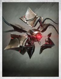
These robots form destiny are the references that I’m going off of as you can see they are rather sharp and pointed edges which gives that a dangerous look, this is what I have integrated into the new design of Clank. I am going to do a few sketches of the new design of Clank and intemperate this kind of colour pallet within his design by giving him a glowing area (possibly his eyes and antenna) and have most of his body a darker grey and/or black in colour.

Biography – Clank was created in the Robotics factory and was commissioned for Decommissioning due to a technical fault. Clack manages to escape the facility with only a missing arm and a few parts of his metallic shell missing. He escapes to the planet (Ratches planet) where he lives in secret as a bounty hunter, slowly reconstructing his body back to its former glory with his victims parts.
Evaluation:
Recreating a character for a completely different audience was an interesting task to do and this is because it is going to help me with the development of my own characters. Seeing how I can change one character that was meant for a specific audience to another audience is going to help me when creating my own character, being able to change my character to appease to my own audience is going to help me if there is any issue with the design that I all ready have.
Other robots- http://destiny.wikia.com/wiki/Vex
Ryu’s rigged animation
Introduction:
Within this session I am going to be creating a 3D animation of two different actions performed by the Street fighter character Ryu. The first animation is of his idle and the second is going to be off of his famous Hadoken move, both of which are going the be difficult to do because they have to be done with a CAT rigged character as well as the fact that I have only done a slight amount of animation with fire and the movement of non-rigged objects.
Ryus rig – starting off with his animation was the difficult part to do and the reason for this is because I had to align all of the rigged characters limbs and his body with the original video image in order to start the over all animation.
After getting the rigged character to be the exact stance as the first frame of the video I had to adjust piece by piece of his body to match the corresponding part that was moving within the video itself. I started with moving his pelvis because this is where all of the movement is going to initially going to come from, so making sure that the pelvis bone of he rig was a accurate to the video as it possibly could so the rest was going to be an easy task to do. If I moved any other part of the body before I moved the head it would have distorted them when I decided to move the pelvis so moving the pelvis first was a good idea to do.
This is the animation that is side by side the original video so you can see the similarities and differences between the two. As you can see there is a few things that went wrong, for example my rigged characters left arm jolt up and then back into the original position. I tried to solve the issue within editing, however this didn’t work as I couldn’t find where the key frames were that caused this issue. Although there was some issues with the animation, this was understandable because this is my first time animating a rigged character.
Hadoken
For the second animation of Ryus was to do his Hadoken. this was a little easier to do because his idle stance was already done all I needed to do was to align his body to the video for the rigged character to do the Hadoken. Unfortunately the rendering of the Hadoken that I did wasn’t complete and the part that I did complete the rendering failed.
This is what I was going to be animation my rigged character to.
Evaluation: Throughout this task I learnt a lot about the creation of making an animation and how difficult that I can really be. I have vastly improved on my animation skills because of these tasks that I have done and the skills that I have learnt through this experience are going to help me in the long front of creating the animations for my very own character as well as with other animations of other Street fighter characters.
Ryu’s audio (week 3)
Unit 9 1.1
Introduction
Within this session I am going to be looking at audio of the Street Fighter character ‘Ryu’ form both Street fight II and Street fighter V and I am going to be critically comparing them to one another and analysing them off of how many there are and the quality of the audio that is recorded.
Street fighter 2: Throughout the video clip that I watched where Ryu was fighting against Ken I noticed that they had the exact same audio for both of them and this is because Ken is practically a re textured Ryu until the later games where he starts to adapt a bit of characteristics for himself. The audio that Ryu emitted was rather robotic in the way that it sounded, as well as this there was only three different pieces of audio the I could define against the Hadoken and the Shoryuken and Shinku Hadoken these were the only pieces of audio the character Ryu said within his fight.
Street fighter 5: Within street fighter 5 Ryus’ voice is far more auditable, smooth and realistic to that of Street fighter 2 and the main reason for this is because the technology change has made it possible so they can sound much clearer that they did within the younger versions of the game. Also within the newest Street fighter (V) Ryu has more audio than he didn’t within the earlier games, he has about 10 different auditable phrases/sounds throughout his fights.
Comparison
In street fighter V there are sounds that are used for different actions the Ryu does , For example: there is a sound when ryu jumps back or throws a player over him where as within the Street fighter 2 he didn’t make any noise when he pouched or kicked this is because of the amount of storage that they would have had when Street Fighter 2 was developed. He only made a sound when he did his power moves as well as having sound effects for being damaged when in Street fighter 2 they didn’t make any sounds when they were damaged which emphasizes the impact sound making the player know that it was a powerful attack.
Storage was a really big thing in the early day because there wasn’t a lot of storage availability which meant that it was really difficult to have so many different sounds within one game at the same time. However, as time has progressed this has became less of a problem allowing developers to create and add more sounds to their games.
The Purpose of adding more audio to Ryu is to make him more of a character and an individual, this is because within Street fighter 2 Ken is exactly like Ryu and throughout the games they have added these different sounds that both of the characters will give off with different moves which brings them apart and different from each other and making them more of an individual character.
They are rather suitable for Ryu because his character is filled with a lot of power and he’s martial arts for his background which is shown through his clothes and the shouting that his gives off when he does his moves which is a really good addition to both what he wares and his character as a whole.
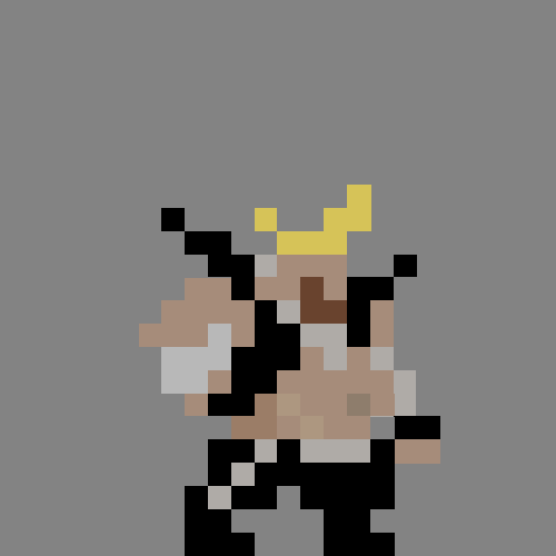
Ryu pixel art (week 3)
Introduction
Within this session I am going to be creating pixel art for Ryu for the series Street Fighter series. The stance that I am going to be creating the idle stance. To create the pixel art I am going to be using the program Photoshop to make a 2D Pixelated version of his idle stance making it look as identical to the original image.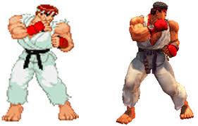

At first I decided to create the silhouette of Ryu before I decided to add the colours to the 2D pixel art. The reason why I did this first is so that I can get the rough outline of his idle stance before adding colour so I can figure out the proportions of his body and where I am going to be adding the colours.

When I added the colours I only added the base colours without adding and definition to the model as well as proportions to the colours that I have given to him life and make him start to have a shape of his limbs and JI.

After I put in the base colours I decided to edit the colours around the model to give the pixel are more depth and make more of the character stand out, by adding shading and different colour textures.

This is the final design that I have created for my Ryu pixel art, I think that it turned out pretty well for my first ever pixel art especially when I was trying to create Ryu to only basic shapes and colours which was rather difficult to execute because of the small scale that it had to be done within. Next time I could work on making sure that his bodies silhouette.
Evaluation:
Making pixel art for the idol Ryu from the Street Fighter franchise has helped me understand how fundamental a characters colour scheme is to them and the audience that plays them. I have also found out that the colours of a character symbolizes who the characters are, their story and their meaning, this is going to be very helpful when thinking of the colour scheme for my very own character and how I can make his colour pallet Idolize him/her.
Next time I could spend a little more time in getting the over all shape of Ryu as well as putting more indentation within his clothes and skin so it doesn’t look like one solid object.
Speed drawings (week 3)
Introduction
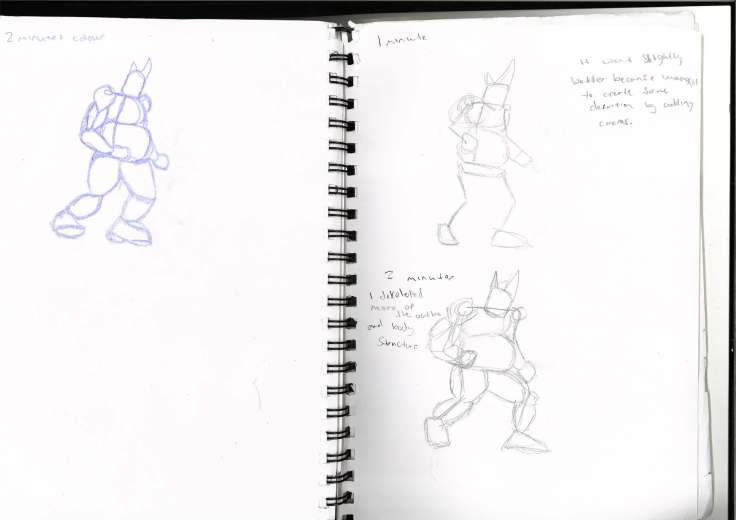
For this session I have been given the tasks to do three to four different drawings that each have different set times in which they have to be completed by. The first one has to be done within 30 seconds, the next one has to be done within 1 minute, the third one has to be done within 2 minutes and the final one has to be completed within 3 minutes with as much details as we possible can do within the time given.
Ryus idle
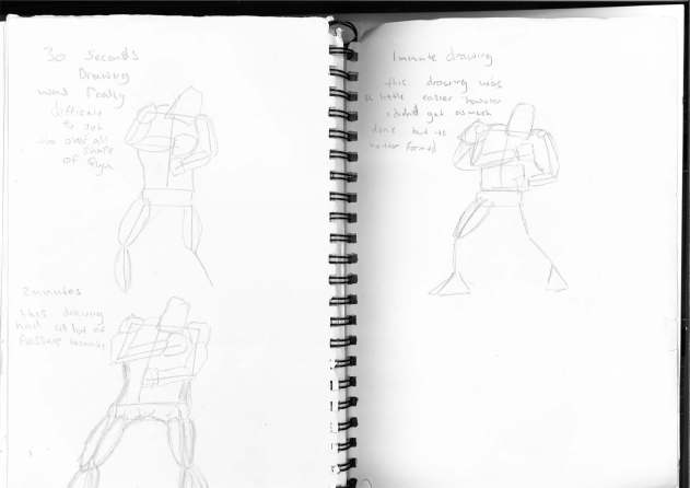
The three images are of Ryu in his idle stance I was given different times to do each of the drawings ranging from 30 second to three minutes to see whether I will improve with what I do under a time of stress and time.The first image (Top left) I drew was the 30 second drawing, as you can see I have only been able to draw the skeleton and a little of his outline. This is because I was working out the portions of Ryu and how his body is going to be positioned and how his body is going to be twisted.
For the second image (right) I had 1 minute to complete the drawing of Ryu idle, within this drawing you can see that I have added more of a outline of the stance mapping out all of his body parts and shapes of his body. At first it was hard to map out all of the limbs and how they would be positioned.
For the third image (Bottom Left) I had 2 minutes to complete this image and as you can see I have added much more detail to the shape of the character as well as having the over all outline of Ryus idle.
Ryus Hadoken

Within these images I am speed drawing the hadoken stance at the end of Ryus move and his CA when the ball of Ki releasing from his hands. In the first image is my test drawing that I drew the bones of Ryu working out how his body is twisted and how it is positioned at the end of the move.

In my second image (right side) I had 30 seconds to draw as much or Ryu as I possibly could, It was difficult to so within 30 seconds because of how his body was twisted and how his arms overlay one another as well as how his body is now completely side on. I had two different attempts at completing his stance within 30 seconds and the second time that I did this drawing (bottom right) I got more of a human body build and the final shape of the body was finally coming.
In the third image (top left) I had 1 minute to finish this drawing which was a little easier to start adding some details to the arms and legs giving them more of a realist look for the muscles and positioning of the body itself. However I didn’t get as much of the body done as I did in the previous 30 second drawing.
In the fourth image (bottom left) I had 2 minutes to draw this drawing. As you can see I have changed the way that I was drawing and this is because it was an easier way that I found for drawing it. Instead of trying to draw it to the exact style of the game I decided to draw it in my own style and this made it easier for me to map out and draw all of his features and body positioning.
For the final image (below to the right) I have drawn a final image the we was given three minutes to complete. This time I decided to get all of the shapes of his body (muscles and positioning) and then I worked on getting all of his aesthetics by drawing his head band and his clothes as well as his hair. To finish it off I added the energy field around his arms and behind his feet to show his movement.

Birdie
My first drawing (above top left) of birdies idle was a little easier to do because of the help the I had for drawing Ryus idle before I did this task. I have only drawn the skeleton of Birdie because I was getting the over all idea of how his physique was going to be like when I drew him in more detail. The second drawing was exactly like the first drawing, I decided to experiment with the angling of his body parts mainly how his body was arched, how his arms were positioned and how his head tilted to make it look as close as possible.
My third drawing (below top right) I was given a minute to complete this drawing of Birdie in his idle stance, as you can see I have added some over all shapes of his body mapping out where his body is going to be formed and how his body is going to be positioned. I have only game him a few defining circles to show off his body structure and how it is going to form throughout the other drawings.
My fourth drawing (below bottom right) I had 2 minutes to complete this drawing instead of having 1 minute as I did have for the last attempt at doing this drawing. As you can see I have greatly improved on the over all shape and design of his body making his body more rounded and adding features such as his muscles as well as more of his bodies over all outline.
My fifth drawing (below left) For my fifth attempt at drawing Birdie in his idle stance I had 2 minutes again to complete this task. However, there was a twist with the task where I couldn’t make the pencil move away from the paper until the two minutes of drawing was up and/or the drawing was complete. As you can see from this drawing I had been able to complete his entire body structure as well as rounding off all of his body parts defining them and making them accurate to the games design.
These final two drawing are of that of Birdies bullhead attack. I have found two key frames of this attack one at the beginning of the attack and one at the execution of the attack. The task for these drawings was to do them within three minutes without moving the pencil off of the page which was hard enough to do.


Evaluation
Overall I am happy with the outcome of my work, at first it was a little untidy and unprofessional but as I did more of the drawings and progressed through the tasks and the various drawing stances I could see that I improved vastly making minor tweaks with each and every drawing that I did. To further improve my skills speed drawing I will work further into doing other time trialed drawing where I set myself a specific time to draw a certain image to the best of my ability to improve this skill of the next time I do this.
Ryus idle – I though that the development throughout the whole process of drawing Ryu in his idle stance was really sudden from changing from trying to make him look like the exact image to interpenetrating my own style within the drawing. To help myself keep at this level in speed drawing I am looking at practicing doing these types of drawings with not just characters from Street Fighter or any other game but looking at every day objects and try this technique on them as well.
Ryus Hadoken -I though that the way that I was drawing was very sudden in the fact that I changed it from trying to draw it exactly to my own style which made it turn out much better then trying to make it as accurate as I possibly could.
Birdies idle – I though that doing Ryus idle and his Hadoken helped me in making Birdies idle stance because I already had a little practice in drawing outlines and body structures. It was a little difficult at the beginning because of the overall shape of Birdie is far different from how Ryus body is structured and positioned.
Unit 9: Street fighter as a Lego franchise (week 2)
Introduction
Within this session I am going to discuss the audience for both the street fighter game and Mortal Kombat game and checking out their differences between their game play, what characters that they have within and how both genders are represented within them and how this works with their audience that they are aimed at. I will also be discussing how they would be suitable for the Lego franchise as well as why they wouldn’t be suitable for the Lego franchise.
Comparison between audiences
The audience for Lego is general based for the younger ages this is because of the colours that are used as well as the characters’ overall design it isn’t too flashy and there really isn’t much details within the anatomy of the body build (i.e. they all share the exact same body structure as one another unless it was for bigger characters but overall they are still rather plane). Lego is mostly based at the younger ages but because of its diversity between characters and for its nature, it hasn’t really go a specific age group because of this reason.
The audience for Street Fighter is for more of the older age range because of the main reason being the over sexualisation of the female characters throughout the games series they show more skin then there are clothes on the women which doesn’t make it suitable for the younger audience (for example: R. Mika is a very sexualised character because of her whole attire as well as Laura).
There are some similarities with the games and some differences too; the main similarity that stands out to me is the bright colours that are used within bother of the games, within the Lego games it is used for most of the props and building and in Street Fighter it is mostly for the bright clothes that the characters are waring. Diversity is another similarity between these games, they both have a range of characters that you can choose from. Although, Street fighter doesn’t have as many characters as the Lego universe has, however they do allow the players to customise their desired character that they want to play as (normally up to 4 different attires) which brings self-customisation the Street Fighter).
They also have a lot of differences the main one being how they represent both genders, within the Lego games they are generally exactly the same body built except for the bigger, bulkier characters (for example: The Hulk, Dooms day, Man hunter, etc.). Whereas within the Street fighter series all of the characters have out lining features mainly the women because of their oversized features and their little clothing that they have which makes the character (especially female) over sexualised. Another difference between both of these games is the violence within them.
In Lego the most violent thing that you are going to see throughout the game is simply Lego characters falling apart, whereas within the Street Fighter series they have rather brutal and crude finished (depending weather they are male of female characters) and they are generally far more violence within the Street Fighter games.
What would be more appropriate for a Lego franchise, Street fighter or Mortal Kombat X? Why?
It is a difficult decision to make to choose whether it is better to have a Lego franchise about Mortal Kombat X or Street Fighter V, this is because they can be both equally be developed into a game of Lego because some games that the Lego company have made are already changed from being games that are for 15 years olds to what they are within the Lego universe.
Both of the games would be labelled to the same type of audience even if they were over sexualised within the original games because of the female characters are within both Mortal Kombat and Street Fighter are, but they can be changed to look as normal as the other character do within the other Lego games.
For example: within the Lego Star Wars games princess lea has become less sexualised from the scene on Mos Eisley when she has been captured by Jabba the Hutt and this is the same way that all of the characters within Mortal Kombat or Street Fighter could be changed for the purpose making one of these games a series for the Lego franchise.
So I personally think that the best game that would be more appropriate for a Lego franchise is Street fighter and the reason for this is because of the characters that are within the game, they all symbolise a different culture background and they are all different because of this reason and It would also be good because of the comedic element that it entails within the game it isn’t all super serious as Mortal Kombat is. A good example for this is when the character Birdie eats a banana and throws the peel onto the floor which causes the other player to slip on the peel and making it easier for Birdie to attack.
Comparing the audience between MKX and SFV
There are a few differences with the audiences within both Mortal Kombat and street fighter the main thing is that Mortal Kombat is definetly aimed more around the older and more mature age range rather than being around the ages of 7-12 this is mainly down to the amount of gore and violence within Mortal Kombat and it is extremely gory and graphical with most if not all of the Fatalities (
This is differnet for the audience for Street fighter because when they have a finisher it isn’t filled within gore and the amount of realism and graphical content as Mortal Kombat has. So this is going to be suitable for a younger audience because of this reason as well as having a more of a cartoon approach to the characters design and personality.
What are the problems with street fighter for a Lego franchise?
There are a few problems for the street fighter franchise, one of the main reasons of why I think this is because of the movement that the Street fighter characters do within the move set and their final critical arts that a Lego character cannot preform because of the limitations with the limbs and joints of the Lego design so many of the moves that are within the original Street fighter wouldn’t be able to work.
Another aspect that I see as a problem with Street fighter being a Lego franchise is because of the different builds of the characters are really different from one another and each of these come as an advantage to perform the moves that the character is designed to do. Lego characters however are only two different sizes; one being really big and bulky and the others being the ordinary Lego build which in turn takes a way some meaning of the characters (in the game the way that a character looks tells you a little about their move set, how they are going to move and who they are as a character).
Bibliography http://www.neogaf.com/forum/showthread.php?t=1208858&page=1 idle poses
Venn diagram (week 4)
Introduction:
Within this session I have created a Venn diagram that shows the differences and the similarities of both the Lego and the Street fighter games finding out what they both have in common and what they have that is different.
Evaluation:
I have found out as much information that I could about both of these games by researching using the internet and by playing these two games, Understanding what these games have that are in common and what is different is so that when I create a character I can make sure that it is suitable for both of the game rather then just making them for one game.
Birdies Audio (week 5)
Introduction
Within this session I will be talking about Street fighters V character Birdie. I am going to be looking at his audio that he has had through the street fighter franchise both in Street fighter Alpha and Street fighter V and discussing weather I think that they are appropriate to his character and how he looks and acts.
Within SF alpha 2 when the round starts and you play as Birdie he lets of this grown as if he was woke up from his slumber where as within SFV the beginning sound that Birde makes is of him saying “Hey!, it’s not too late to run away” while he spins around his chain and licks it which personally I think that it is far more intimidating then just letting out a grunt.
Throughout his fights he does let off some audio as he plays out his moves, he does however old produce three different types of audio as he is fighting and these being when he jumps to do a belly flop, when he is damaged by the opponent or when he uses his move ‘Bull head’ these are the only three sounds that he creates. His voice within SF alpha is rather groggy, burly and deep like a biker is normally addressed to have.
Within street fighter V he has way more audio that he says throughout his fighter compared to SF Alpha, he has up to 13 different sounds that he makes without all of his moves and damaged moves. Within SFV he has kept the same type of voice, very low and groggy biker voice.
The reason why they have given him this type of voice and sounds when he is fighting within SF Alpha and SFV is because in street fighter Alpha they haven’t given him an awful lot of audio mainly because of the recourses back then they didn’t have enough room for more than a few sounds per character. As well as this is that most of his sound effects are when he uses powerful moves, so the sound that is given off give a sense of power or high damages as he does these move or they took a lot of energy to perform.
The performance of the voice isn’t very realistic, as I discussed with Ryus’ voice also it is rather robotic but this is because of the era that these games were created there wasn’t a lot of high quality auditable sounds that they could have.
Within SFV there are definitely an increase of the amount of audio tracks that are used for Birdy and this is because of the technology that Is available is far greater than is was when the SF Alpha was made. Also he makes more sound affects when he is performing moves and I personally think that this is because of him being over weight which is why even when he did lighter moves (for example: kicks) he lets out grunts whenever he moves his overweight body.
The performance of Birdies voice is also better sounding less robotic and more organic which help his character (Birdie) portray meaning where in this case it shows that he is un fit by making these grunts as well as his attitude and voice gives then impression that he’s a biker too.
Birdie rigged animation
Introduction
For this session I am going to be creating an animation using ‘3Ds MAX 2017’ by using a rigged character I am going to create the idle motion of the Street Fighter character Birdie to the best of my ability trying to make it as accurate as I possibly could. Hopefully the skills that I have taken on board for the last animation that I did of Ryus idle and Hadoken move.
As you can see there is once again issues with this animation even through it is my second attempt at creating an animation for a Street Fighter character. The visible issue that has occurred is the texturing has made the rigged character become shadowed and rather hard to see and this has caused an issue when I was trying to check the character for any movement glitches or deformities of their body while I was animating them.
Another issue I noticed was he starts to lean back throughout the whole animation and this is because of key frame that starts the next part of the animation. I did however try to resolve this matter by inserting another key frame before the next animation starts and I reset the movement so he was at the correct position throughout the animation. However this did not resolve the issue that was at hand and he still arches back throughout the while animation.
Evaluation:
Throughout this experience of making another animation for a different character within the street fighter games was quiet enjoyable to do because of the difference between both of the characters movement and their stances made the whole takes a little challenging to manage. The reasons for this is because of the over all movement of Birdie is a whole lot different to a fighters stance and its more sloppy then any other characters like Ken, Ryu and even Chun Li.
My over all progress and completion of the task I was rather happy with even with the few issues that did occurred. The whole of the animation I was pleased about getting the timing correct and the movements.
Birdies pixel art (week 4)
Introduction
For this task I am going to be creating birdies bull head attack within Photoshop animation tab by using pixel art to create a similar design as that of the pixel art that I did for Ryu but adding animation which is going to involve various amount of frames instead of just the one frame.

For the first image I have found out what birdies idle stance was and created to the best of my ability to to make it look as close to the original as I possible could to make it. I started by making sure that all of his features were as perfect to the original as I could. After I added the details to give it a 3D affect to his belly, chin and other parts of his body.

After I finished doing the First image I decided to find the next key frame that is within birdies bullhead animation which was the point where he lifts up his head and leans up backwards to ready his strike to the opponent. The reason why I didn’t start with the next frame is because this would have been too fiddly of a task to undertake for the time that I had to do this within, so sticking with the key frames is a really good start to the animation.

For the last frame I looked at the point of impact where birdie finally hit the opponent at the end of his bullhead attack. This is the final key frame because it is the last point of action that he makes within this cycle so it is a good one to pick out of all of the frames.
Evaluation:
Creating another set of pixel art for the character (Birdie) I am finding out more about the importance of a characters colour pallet and how recognisable these colours make them, although it is only 16 by 16 pixels it is quite easy to see what Street Fighter character this pixel art is off of. For next time I am going to work on the colouration of Birdies body trying to make his skin tone to the exact same colour as it is in the game as well as adding different tone effects to his body giving him more definition.
As well as making his skin and clothes look more realistic I will create more then just the key frames for the animation, I will work on creating some of the other frames that are in the middle of the key frames to make it looks smother and making it look professional with colour change to when he charges the attack.
Unit 9-10 Black street fighter characters (week 5)
Introduction
Within this session I am going to be discussing the different Black make characters that Capcom have used within their street fighter games and talk about why Capcom has made these characters look the way they look, who I think that the intended audience is and weather they represent cultural diversity in either positive or negatively as well as if they put forward any stereotypes. I am going to be using two characters for the street fighter games those being Birdie and Dudley.
What are the problems for these characters?
All of these characters have some pros and cons with them, but it all depends on the character, for example: Balrog has a negative stereotype by the way that he acts and for what the character does within the camping within the street fighter franchise. Balrog is a ruthless and un caring character that is rather psychotic and in the way that he acts as well as him joining a local gang to cause pain and havoc for everyone.
Another character that is a bad example is Birdie especially the new design, he slumps around and he is rather unhygienic and putrid in both his appearance and the way that he acts.
Birdie and Dudley
Why did Copcom choose to design/redesign these characters in this way?
Capcom have redesigned Birdie the way that they have because he has supposing been on retirement for a short while where he put on weight yet still kept some muscle. Although some of his features have stayed the same as it was within SF alpha to the newest game SFV and these features being the attire that he wears and his Mohawk as his facial features. However, the cartoon stylized style that they are using has made him look as if he is sad rather than the pervious anime in the SF Alpha.
http://capcom.wikia.com/wiki/Birdie

Capcom has designed Dudley the way that they have because of the person who he is based off of and this person is Chris Eubanks who was a British boxer who wore both a monocle and a top hat where ever he went as well as carrying a Cane to complete his attire. Which is by Capcom has made Dudley look the way that he looks and why he always keeps on his boxing gloves because Chris Eubanks didn’t take off his monocle or top hat.
Who do you think the intended audience is?
I think that the intended audience for Birdie is both for the younger age as well as the older generation, the reason why think this is because of the over all way that he looks and acts it is very comedic and childish and it portrays monkey-ish characterists which is better for the younger generation and for the older generation. As well as this is his attire, it isn’t too menacing to the eye by extruding and harmful additions upon it and it is very simple in colours and not too complicated.
For Dudley I think that the intended audience for him is the older audience because of they was that he acts is rather civilized and formal as well as the way that he dresses it is very high class. However, it could also have a comedic note to it as well because of the wat that he is dressed it is rather formal and particular cloths, seeming smart, wealthy and somewhat funny.
Do they represent cultural diversity?
For Birdie I think that he doesn’t show cultural diversity simply by the appearance of him, the way that he acts and the things that he does within his fights by making himself be presented as a slob and un-ruly on what he does about his look.
For Dudley he does show culture diversity by adding a rather true British character who is rather eccentric in both his mannerism and appearance shows that he is indeed British and that shows that the game has a lot of cultural diversity. Another character is Chun Le who’s from China and by the way that she dresses and acts really evokes where she’s from.
Does they use stereotypes? If so, what issues does this raise?
Birdie brings up some stereotypes but in the case of a negative sense and the reason why I think this is because of the way that he acts sounds and his over all look as well. The issues that this raises are very bad towards a younger audience by potentially making them think that this is what and how black people act, all slobby, weird and very un-hygenic.
Dudley Shows a very strong stereotype for the British by showing that they are all well spoken an snobby in the way that we act and speak as well as how British people dress and act, by making Dudley drink tea and ware the smart clothing that he does. This does raise a bit of an issues making the British seem snobby in the way that they speak and dress in a odd and peculiar fashion.
Are there any examples that offer alternatives?
For Birdie they could have made a few alternatives to what he looks like which could make him look less of a bad and slobby character. For starters they could have left his physique as it was within the SF Alpha game instead of giving him a bear belly and making him slouch. As well as this they could have made his clothing more punk rocker by adding a t-shirt and spike on his shoes.
For Dudley they could change things to do with his character design to make him less of a stereotype by changing his attire and making it les flashy to the eye making it seem more simple and stylistic to a type of martial arts rather then having some overalls combed hair the way that it is as well as the mistouch that he has.
By making him sound British and possible having wrist bands or a hair band that shows the Union Jack symbolizing that he is from a British background.
Chris Eubanks picture: Chttp://www.dailymail.co.uk/sport/boxing/article-2836941/CHRIS-EUBANK-not-doting-father-way-build-fighter-like-son-throw-wolves.html (accessed- 15/10/2016)
Pitch for characters (week 6)
Introduction
For this session I created a powerpoint for my pitch describing the two characters that I had in mind to create for my final character animation. I explain what type of fighting style they have, what they’re going to wear, their back story, etc.
My first character is called Maximus Prisca meaning “Greatest ancient” in Latin, the reason why I have called him this is because he was born in the Roman times meaning he is thousands of years old much older than any of the other characters within Street fighter other than Necalli. The reason why he is alive and so old is because he was born a half god (demi-god) and his father is Mars or ares in Greek “the God of war”. His being the son of the god of war has given me the idea to add flames to some of his attack and moves, for example: when he preforms his heavy attack his hand catches a light and hits the enemy with great force setting them a blaze for a short amount of time (Like F.A.N.G.S poison attack) only lasting a few milliseconds.
Another time that this effect is going to happen is him Critical Art when he initiates the move as well as his V trigger where he gains double his strength and twice the resistance his body is going to be covered with flames which is where his power will come from.
Clothes
For his clothes I did a little research on what Roman gladiators would have worn when they were going out to fight for their lives. So I looked at various different attires that the gladiators wore ranging from the golden armor all the way to the leather Armor to see what they have in similar and what I would like my character to be based around.


This Armour I though was pretty fitting to the idea that I was originally thinking for making my character look like for his final design. making him very robust and Armored was the initial kind of attire that I wanted him to have. I decided to get some variations of the attire by looking at the different types of armor sets I got some of images of armor that was worn by the guards or chariot riders. This I though was too much for me to be able to complete and design in the time frame that I had to create the textures and the animations for my character. As well as this it would be a pain to design all of the arm by having the amount of scales that is has as well as having most of the face and body covered would make it hard to see my texturing work.
The bottom image is off of another type of gladiator, one who rides on the chariots or uses a spear as his weapon. Like the first image it is going to be difficult to pull through with this type of armor because of its shoulder plates bulging out to the sides of his body. Most of his body has been covered also so I would have to create a model that went all around his body so it is going to take a rather long time in order to create his outfit.
The third type of armor that I looked at was a gladiator brute who has got more skin showing more than the other two that I looked at which was a good thing because I could actually make this as a design for my characters attire because I could add most of his attire onto his texture that goes along with him body except from his head.


Peer feed back:
When I did my pitch I got some peer feed back from my class mates and they gave me the ideas of implementing fire to Maximus’ attacks through either his V trigger or through his attacks when he goes for a heavy attack or within his CA.
Another thing that they suggested was to do with what he is wearing. Luke gave me an idea to give him a helmet that has a Mohawk which is going to be the item that sets on fire while using the V trigger and/or his critical art.
Secondary character
For my second character I created a character called AI meaning “love” in Japanese the initial frame work of AI was based around a female Samurai. This made it rather interesting to both research and work out how I would design he character and her story behind her. I decided to look at the history of the Samurai and take a look at what they looked like, for example: attire, colour scheme, body posture and stances of attacks, how they would move, etc.
I did all of this so I could get the best Idea in how my own character was going to act, dress, move and generally what type of things that my character is going to be doing over all within their animations. These are two of some of the images that I got a Samurais armor is very big, heavy and intracute looking to the eye and this is because most of their armor was made up of tiny pieces of folded paper overlapping one another making their armor in its time and still today a rather good piece of armor against swords.


Trying to make something like this for my character is going to be a task in itself if I wanted to make it to the exact specifications that the armor has as well as the textures and the details that go with it in order to make it look as ashtetic to the original image.
I found out that it was going to take more time then I had to create this outfit so I looked into for of the female attire rather than the overall general Samurai look.

The female Samurai had a very different look to their attire that the males had although they could also wear what the males ware too it wasn’t very often. They tended to ware a Gi that looks like the one I have in the power point. However their Gis have a rather colourful look to them with sharp colours and very detailed drawings of dragons and symbols.
Peer feed back:
There was a little feed back that I got for my secondary character. Jay asked how one of her main attacks was going to work as it was similar to that of Ryu, However she emits sword/s in a flow of energy that attacks the opponent with a hardy blow which he then agreed with the overall idea and suggested that she’d point her fingers and a channel to focus the energy.
Evaluation:
Throughout the research I found out more about how to make characters of my very own and what is needed in order to make them to a specific audience and a specific background. I discovered how to write a professional back story for my characters, how to make up attires, move set and their voices to a professional standard.
Bibliography:
Golden Armour: http://www.globaleffects.com/C_b20_frameset.html
Guard Armour: http://www.globaleffects.com/C_pages/Rental/Wardrobe/Armor/Period/CompleteSuit/European/romansoldier972_hi.jpg
Fighter Armour: http://www.globaleffects.com/C_pages/Rental/Wardrobe/Armor/Period/CompleteSuit/European/bank1_2_06_hi.jpg
Titan Armour: https://www.pinterest.com/explore/gladiator-armor/
Samurai 1: https://www.pinterest.com/pin/418834834072408850/
Samurai 2: http://jameelcentre.ashmolean.org/collection/4/1238/1241/all/per_page/25/offset/50/sort_by/date/object/12472
Female Samurai: http://allthatasia.com/pictures-capture-the-female-warriors-of-samurai-era-japan/
Street Fighter Movie Comparison
Introduction:
I was given the task to look at three different movies that are about the Street Fighter franchise and they all show off a different style from both visual and in terms of what they are about. The three movies that I am going to be watching then comparing are Street Fighter: Assassins fist, Street fighter 1994 and Street Fighter 2: The animated movie.
How did the creators of street fighter movies and games adapt the franchise of varying audiences?
For all of the movies they all show variety within their audiences through their adaptation of some aspects that are within them, for example:
The Street Fighter franchise is a universal and a world-wide brand that is known in many different cultures and types of media such as games, Tv/ comics and films that all show different sides and adaptions of the original Street Fighter series.
The Street Fighter games have adapted the was that you play the game by making all of the characters cartoon to the appearance and has covered any form of violence to something that is of slap stick comedy, by making all of the violent acts that are done within the game seem visually un-damaging to the opponent or the player and only giving off light flashes and movement as a sign of damage. This appeases to both the younger audience because of the use of comedy and non-bodily damaging moves (unlike Mortal Kombat) and to the older audience too within the visuals as well of the artistic design as well.
Street fighter assassins fist has been adapted so that it isn’t too violent and too graphic to the audience. Within the movie there is a level of violence but there isn’t anything that is perceived to be too graphical and violent within this movie even with the spiritual powers that are given through the “Hado”
For the anime based off of the overall look and almost comedic tone to it makes it suitable for the younger audience especially with some of the characters that are within the movies, however there is some nudity as well as scenes of torment that is for the more mature audience such as older teens and adults.
How did street fighter assassins fist compare to the previous movies, both Hollywood and anime?
(Street Fighter Hollywood movie 1994)
The film Street Fighter: Assassins fist took a new, fresh take on the Street Fighter franchise by giving the viewers an in site on something that hasn’t been looked upon within the other movies and this is the origin story of the two main characters that are within the SF series (Ryu and Ken). Within the other movies (Street Fighter 2: The animated movie and Street Fighter 1994) they are both well into the future of the two main characters so you don’t know how their powers were able to become right from the beginning and Assassins fist tells you how they came to terms and learnt these powers that they posses. Within Assassins fist they have made sure to keep to the characters overall backstory and traits as well as looks within the movie unlike the other adaptions of Street fighter. Assassins fist was initially created for a project that soon transformed into a full fledged TV series that was funded by the fans and they showed a lot of devotion to their fans because they looked into all of the details that their fans wanted.
The 1994 Street Fighter movie wasn’t that focused on doing it for the fans as well as much into the role of their acting unlike how they were in the Assassins fist movie because of their cause was different for both of the movies. As well as this the 1994 Street Fighter movie was mainly for the money because of the big celebratory of the time Jean-Claude Van Damme who played one of the main characters ‘Gyle’.
Street Fighter: The animated movie had very similar character interpenetration of that of the Street Fighter: Assassins fist movie had. Both of the two main characters in both of them are exactly identical by both being Ryu and Ken in both of the movies. Within these two movies their characters are almost identical through both of these movies by having Ryu as the serious and devoted character and Ken being the more ruthless and somewhat careless character out of the two. Other character were explored within the animated movie characters such as Chun Li, Cammy, Vega, M.bison, Barlog, etc and they went into a little detail in who they are and what their stories were where as in the Assassins Fist movie they only focus mainly on Ryu and Ken.
How did street fighter movie game compare to street fighter 2 game?
Street Fighter: The Movie Game wasn’t of the best overall quality even for the time that it was released in 1995 mainly because of they didn’t use the typical sprites that any other Street Fighter game has and as well as this it was doing the exact same thing as their rivals Mortal Kombat in their 1992 game where they would use realistic sprites that are from their previous movies. I personally think that this made the game rather terrible because of this use on sprites and that it would have been better if they used actual sprites rather than using the ones that they did within the game.


Street fighter 2 had far better sprites for the characters and its use of colours were also sharp and well presented unlike Street fighter: The Movie Game because the colours within that game were rather dull and dark toned which made it difficult to focus on most of the characters moves as well as the background because it was so distracting of the sprites that were used.

Furthermore, within Street fighter 2 all of the colours are all set around the same level and they all blend within one another making it a rather pretty game to play and enjoy.
Which character in street fighter assassins fist appealed to you most? Explain why?

Within the movie Street Fighter: Assassins fist the character that best appealed to me was Ken the reason why I think this is because of the characters development throughout the whole movie. At the start of the film Ken is rude, uncaring about what Goken told him, questioning his master occasionally and the most being impatient and unruly of his masters ways. Throughout the first half of the movie the actions and attitude of Ken was leading me to thinking that he was going to be the one that turns his back against his master and goes the way of ‘satsui no hado’ and join Akuma. Thinking that both Ken and Ryu both polar oposites to one another so I thought that Ryu was going be in control of the Hado from the beginning.
However, this was not the case for Kens character he in-fact changed his way and realised the true importance of his masters training and how important waiting for his training to be complete really is. He became enlightened and caring towards the end of movie, caring for his friend/bother (Ryu) when he was being taken over by the Hado and taking him on the right path to prevent anything bad form happening to him.
Which character in street fighter 2: the animated movie appeal to you most? Explain why?
Within the movie Street Fighter 2: animated move the character who for me appealed to me more that anyone within the movie was E.Honda and the reason for my choice is because of his over all kindness and personality of his character. He is jolly and a fun loving guy who takes it out of his way to give Ryu some money for helping him win the fight that he was in, even though Ryu didn’t do anything to help him. This shows that he is selfless and willing to help out others even if the y have tried to kill him (in the end scene after M.bison was defeated).
Evaluation:
Throughout these movies learnt a lot the characters backstories and about their origins about their characters especially within Street fighter: Assassins fist, I learnt about the characters Ryu and Ken and their backstories and how their got their powers that they have within the Street fighter games. Doing this research and watching these movies is going to help me when designing my own characters backstory.
Bibliography
Assassins fist – http://www.blu-ray.com/movies/Street-Fighter-Assassins-Fist-Blu-ray/109044/
street fighter 1994 – http://www.avclub.com/article/read-theres-reason-street-fighter-movie-was-so-awf-202068
Street fighter 2 – https://spencerberry.com/2014/12/28/childhood-obsession-street-fighter-ii/
Street fighter: the movie game – http://www.technologytell.com/gaming/124386/5-best-worst-movie-games/
Audience analysis
Introduction:
Within this post I am going to be looking at five different blog articles that are done by different people that all look at Street fighter V game and they all give their own impressions of the game. I am going to be looking through these articles and talk about what they say about their traditional audiences, etc and how I can use this information for my own use when creating my own characters.
Part: 1 Audience Analysis
Unit 10 1.1, 1.2
Part: 1 Audience Analysis- Links
http://www.mcvuk.com/news/read/capcom-targets-newer-younger-esports-audience-with-street-fighter-v/0158783
Part: 1 Audience Analysis- Task
What do the articles tell you about:
1. The traditional audiences for fighting games?
These articles say this about the traditional audiences for fighting games are the casual and the competitive gamers that it caters for. The talk about what they have done for the casual players by giving them a single player champagne that they can play on the difficulty that they want to play it on. The competitive side of everything they’re really hyped to get into tournaments and play multiplayer with players around the world.
Also they discus that they’re having to slow some of the moves down for the characters within the game because of the faster reactions of the newer aged audience so they’re making it slower so there is a gap so the older as well as some not so experienced players can counter the attacks of the other players without being completely annihilated by them.
“There is more opportunity now for competitive players than we’ve ever had in the history of the genre, and we are constantly sharing the excitement of fighting games with the Capcom Pro Tour to new audiences. With Street Fighter V, the game is more accessible and more intuitive than ever before in the series, so this is the perfect time for anyone to jump in and have fun,” Dahlgren said – Why Street Fighter V Is More Than Just a Game
- The problems in broadening that appeal to new audience demographics?
A lack of single player content is a majoy down set some of the new casual audience
How have the developers tried to overcome these problems?How could you apply this new knowledge to your ideas for your characters?
1. Consider: age, gender, education, income, interests, etc.
Developers of the Street fighter (Capcom) have tried to add additional content to the game so that more casual gamers can also enjoy the game to the full experience that they want to play the game at. The way that they have done this is by implementing a single player mode as well as a single player champagne for the casual players so that they don’t have to play online against other player around the world they can play on their own at their own level and not worrying about other players constantly winning the matches that they are in.
For my own ideas and characters I could consider what level of playability of my characters are going to be, by making them either easily controllable or giving the player a slightly more complex way to control my characters. As well as this I could make is so they can make a good match with other opponents around the world by making them easily to control and learn their fighting styles.
I could add a little history within his end quote after they have a victory as well as having it in their native language to serve somewhat of an educational purpose to the characters as well. For age I will make sure that it is going to be suitable for the age and not over by making sure that my designs keep to the original Street Fighter characters looks and style.
For interest of the audience I will try my best to adapt and create my characters around the styles that they already have within the Street Fighter franchise already. Trying to make the moves of my characters interesting and fast paced keeping the attention of the players rather than boring them with slow and basic movements.
Part: 2 Characteristics of the beat ’em-up genre
Unit 9 1.1, 1.2
Part: 2 Characteristics of the beat ’em-up- Link
http://www.racketboy.com/retro/fighting/fighting-games-101-all-you-need-to-know-to-battle
(Fighting game 101)
Part: 2 Characteristics of the beat ’em-up- Task
What are the typical themes of the fighting game genre of video games?
The typical themes of the fighting game genre in video games are that there is a lot of action within them and it is rather fast paced because of the over all style of the games because some matches can be over within a matter of seconds depending of the skills of the other player and timing. As well as this they have a wide variety of different cultured characters that all have different fighting styles and moves to suit and given player.
Combos – Combos is yet another typical theme that is within all fighting type games, this is when a player can hit a chain of moves to create a substantial amount of damage to the opponent and this have been a rather occurring theme through games such as Street Fighter and Mortal Kombat.
Super attacks – Special attack are something that is used within all fighting games such as SF and they are used when a bar is maximised and released to do a substantial amount of damage to the other player.
Mano-a-Mano – The game generally puts the player with opponents that are of the same fighting capabilities so thee is a nice fair game and no advantage for the opponents on the player.
Equality – Though tier systems for the quality of fighters develop in the highly competitive tournament scene, fighting fans expect a certain amount of equality between standard characters. Strategies and tactics will vary, but every character is supposed to be on equal terms with every other character for the sake of balance. If characters are unbalanced, the game is generally met with harsh criticism, though it’s considered acceptable for boss characters to be overpowered, and players will usually forgive an exceedingly weak character as a “joke character.”
Winning Is All – Throughout all fighting games beating the other player until they are KO is the only way to win and progress to the other stages, match or rank. There are many different ways that this could be accomplished and it is very different for each individual game weather it being KO for Street Fighter, Kill for Mortal Kombat, etc. They all lead to being victorious over the other opponent to win the game.
Quarter Circle Punch – Within some fighting games there is a feature where you have to use the joystick or Dpad to use some of the attacks that some of the characters have when executing these certain moves. Like the article said “The most famous is Ryu’s Hadouken from Street Fighter, which involves a roll of the bottom quarter of the directional control towards the opponent, followed by a punch.”
Rounds, Bar, Time, Punch/Kick/Block/Throw, Rounds are other themes and features that are within the fighting game genera.
- How does your character fit, adapt or subvert these themes? Why is
this relevant?
I think that my character fits to these themes because it add yet another type of character within the fighting games because he can relate to quite a lot of these already and I can adapt him to fit them more as further development comes into play. For example; The Punch/Kick/Block/Throw mechanic fits my characters because he is going to have all of the capabilities as all of the other characters that are within the street fighter universe.
What is the appeal of these games? Why do you think people play them?
The appeal of these type of games is the fast pace challenging aspect of them by having such a diverse and multy cultural or variation of characters that are within these games give the players the ability to test out and choose the character that they think best suits their style of playing. As well as this its the over all players experience of the games draws in players because it was a never seen before type of game and it was very divers and interesting to play either with yourself or with a friend.
What are the key conventions/characteristics of the genre?
The key conventions of the fighting type games are;
- Mano-a-Mano
- Competitive Multiplayer
- More Meat for the Slaughter
- Equality –
- All’s Fair in Love and War
- Winning Is All
- Quarter Circle Punch
- How could you use these to develop your character/concept?
I could use these for my own character By not making him overly powered and un able to be defeated, Because him being a demi-god normally refers to him being literally invincible but only having a slight change of him being defeated. However, to go with the other fighting games I could create a way that my character could be defeated. Quarter circle punch is another thing that I could use within my characters development by enabling my character to have a move that requires it to do such a movement with the joy stick or the Dpad to execute either a powerfully uppercut or jab.
How have other developers followed or adapted these characteristics for new interpretations of the genre? What can you learn from this?
There are many game franchise had to adapt something about their games to make them stand out within the crowd and get noticed by the wider audience. Fatal Fury implemented a lane system where it game the players the ability to jump for the foreground to the background in a moments notice. Mortal Kombat implemented digitalised human actors and gory fatalities that range from 1-10 on the most gory moments when violence started becoming a major selling point. Samuria Showdown mainly focused on weapons within their games. Killer Instinct took the best for bother SF and MK by taking the controls of Street fighter and the gory fatalities of Mortal Kombat.
What are the key game-play elements?
There are a few key game elements within the street fighter games one of these is the each character always has six different types of moves one being light, one medium and one that is heavy. Another game play element is fast paced action. Now throughout the Street Fighter franchise it has always been a rather fast paced game and it has only become fast and faster throughout the development of the game itself.
- How does your character fit, adapt, or subvert these elements?
My character fits to this because he is going to have multiple move sets also by having light, medium and hard attacks as the original Street Fighter characters have.His over all movement is going to be slow yet his attacks are going to be fast to keep with the over all speed of the games theme, an example of a character that does this is Zangif.
Evaluation:
Throughout this task I looked at all these different articles and I found out a lot of information that is going to help me out in the long front by allowing me to look back on these articles and this post to see what Capcom has done to Street fighter in order to make it ore suitable for more casual players as well as adapting it to the newer audience. After looking into all of these articles and knowing the knowledge that I do now is definitely going to come in handy when creating my own character because I can adapt them around what I have discovered throughout these articles.
Character Story boards (week 7)
Light punch – I have designed the first punch that is much like all of the other characters that are within Street Fighter V, most of the characters if not all of them have their first attack as a very like jab or slight kick without moving a lot which is why I have made my character do a light punch without moving much of his body.
Heavy punch – For my heavy punch I have made sure that more of his body is involved and I have done this by making the attack come from the rear arm (Right) and his stronger arm. He uses is mass as an advantage to maximize the amount of damage he can inflict. This move will also take some time in the game because of his build and power within the attack.
Light damage – For his light damage there isn’t much of a difference with his idle stance, the only thing that changes between his idle stance is the movement of is left arm by only a few inches and this is due to his size.

Heavy damage – The heavy damage animation is going to be more immediate and involve more movement he is going to be hit down to the point where he is nearly kneeling and then he’ll get back up and carry on with his fight.
Critical art – For the Critical art it involves a lot of infliction of damage. He starts it by opening his arms as if he was going to clap or is in need of a hug, he then slams his fists together which is going to have the energy surging through his body. The camera angle changes to behind him where he then does a right punch then a left punch, which then goes into a right uppercut as well as the angle is changing to a long view. For the final part he grabs the other players legs and slams them to the ground and finishes them off by throwing them behind him and the camera goes back to normal.


Evaluation:
The story boards that I have done are really going to help me out with the recording that I am going to be doing in the future weeks. It is going to help me in executing the moves that I want my character to do within his animations by creating these I have given myself key frames in which I can look at and follow within the recordings to get the precise movements that I want to get for my Lego character.
Next time I can probable add a little more description of what the moves involve so it is a little easier to understand for both me and everyone else (Just in case I got one of me peers to act out for me because of their build, etc).
Character design
Introduction
Within this session I have been given three templates for my Lego character that I am going to be designing, One of the templates were off of three small Lego images that all have to have a different appearance to the other, The second template is off of Lego heads which is where I am going to be creating different facial expressions in detail and the third template is off of two images of the Lego character of the front and the back of the character in which I have to make it in depth and fine lined.

In this first image I have designed two different attires and looks for my character. The first image he is dressed within gold plated leggings with a leather tethered skirt that covers his bottom half of his body, his head wear is based around a spartan helmet that was also used with the chariot rider gladiators and guards of Rome.
The whole idea of this came from having my characters initial backstory of him being one of the kings best fighters in the Colosseum who has been with him for years, fighting and defeating all of his opponents. He was also in the early stages of being a gladiator which is why he looks so clean and tidy.
Within the second drawing I have given him a more ragged look to both his attire and his overall look of his body structure and look. I have taken away his footwear and his skirt and just replaced it with the shorts as throughout his fights he lost a part of this. I have given his shin pads that compensate for the missing leather and I have given him shoulder pads that also help with this. I have removed his helmet and given him long, dark, think and rugged hair that is a mess and untamed. the reason why I have given his this look is because I was trying to make him look old and worn because the look that I was going for is when he has lived through the ages (from Roman times until this present day).
Face images


For these facial images I worked on getting the over all look on what I wanted the face to look like in its final design. I started with the basic and decided to draw a simple helmet that only shows the front and lower part of the face. I made it somewhat symmetrical on both of the sides to make it seem new and unworn, this is because it was to show the birth of his fighting career as a gladiator.
The second image was based off of the same idea as the first image that I drew. However, I added a dark cloak over his face to mask his appearance and giving him red eyes which give off the sudden feeling that he is a bad character. The reason why I did this is because I wanted to add a dark/evil version of my character. The reason for this is because within the Street fighter games character such as Ryu and Necalli have a dark/er version of themselves that is not completely different to the original design but it is different in some ways.
Final character design
For the final product of my characters design is the one below. I have looked throughout all of my previous designs and looked at what ones looked the beast and what I and others liked about them as a whole. I kept his long ragged hair but I made a slight modification to it that make it less messy and ragged to the eye which I think is going to hep me throughout the Photoshop process as well as the texturing and the creation of the character itself.
I have made sure that I made all of his muscles seem unreal and unnatural to his stature (mainly due to the design and structure of a Lego figure and the Lego template that we was given), giving him all of the curves and markings that signified this will help me give off the impression that he is bigger than the other character within the game i.e. Zangeif.
For his attire I decided to take out the overall idea of giving his shoulder plates as well as knee and shin pads because I was thinking about the time that I had to create my character within 3DS MAX was going to take long enough without adding any of these features. As well as the fact that adding them to the bode structures was going to make it harder to animated in fear of them clipping through the image and making it disport and seem off.
I kept the design of giving him both the leather skirt and golden shoes which looks pretty well when they’re put together which my peers and I both agree that it looks well together and suits the whole design of my character.

Peer feed back:
Luke liked the use of hair that I gave my character and suggested that I keep it to give off the impression that he’s really old.
Darren liked the over all look and shape of the characters muscles and attire and he though that they both suited the story and the design of the character.
Evaluation:
Throughout this task I was looking at the fundamentals of making multiple designs for my character whether it being just his face or a full design of his body. Creating multiple designs of the character really helped me to figure out what works well and what doesn’t so I could make the design that both suits what I like and what me peers would like my character to look like.
This is going to help me with the layout of my character and what I want the characters to look like when I am editing the final texture on Photoshop.
Refine characters
Introduction:
For this session I will adapted the drawings of my Lego characters within Photoshop making sure that all of their features look to the best that I would like them to be as well as making sure that they look as presentable as possible so that they can be easily used and applied onto my character for the animations.
We was given some Lego templates like was was given before where we had to add start our designs on paper. At first I was trying to figure out what template of my designs that I was going to be using in order to start with the creation of my in depth and professional final design. I have decided to look at the rugged look my third design of my character and the reason why I chose this one is because I liked the way that I drew his facial hair and the way that I drew his hair, clothes and the way that I designed his features to his body.


The first thing that I decided to draw was the facial features, by doing this it gave me an indication where his hair was going to form and how the rest of the putter half was going to form and take place (muscle lines on his neck). I gave him a ragged look as if he doesn’t look after himself too well and the reason for this is because of his back story, he is supposed to be thousands of years old and been through tones of fights which have each left there print on his body. The tough beard shows the rough time that hes gone through as well as his snarling mouth showing aggression towards the other player.
I have also designed his hair with the same intention with it being rather long as messy shows his untamed nature and struggle that he has been through the thousands of years he has been fighting on this earth.
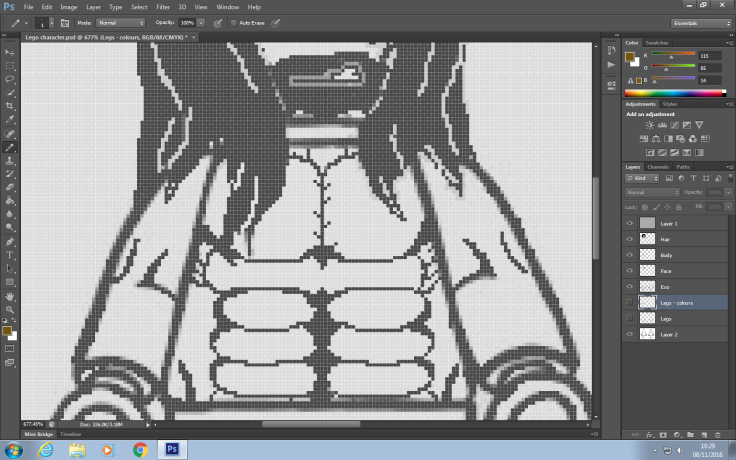
For his stomach I had to do a little research into what Athletic Lego characters physiques looked like as well as human body builders bodies so I could find the one that best suited the character design that I wanted to do for my characters final texture. I Looked at the body builder Arnold Schwarzenegger in the film Conan (Below) and the reason why I did this is because I wanted to see how the human body would look with this much muscle and well as his type of clothing are somewhat similar to the design of my characters.

As well as looking at realism to try and work out the dynamics and shape of all of the muscles that I would need to involve for my own character I had to also look at Lego characters that also have a lot of muscles so that I can see what it is going to look like when it is applied to a Lego character rather then just having human examples as well.

I looked at characters like bane and the hulk because of their body build and their body structure. Bane has a similar body structure of that of my characters and this is good in the sense that I could get an over all look on what my characters body is going to look like and how it is going to make throughout his animation (how the muscles are going to move around as he moves). I did more research on this by looking at how these characters moved within the game ‘Batman: Beyond Gotham’ in order to get the general idea on what he was going to look like when his body moves around.
Clothes and colouring
For his bottom half I have added the skirt and the golden shoes that I had within the drawn design and I decided to keep this because I though that it suited my characters because of the over all design of him and that it would be easy enough to texture over him instead of having all of the bumps and ridges of his knee and shin pads because it would have been a pain to draw the fine details to especially doing it on Photoshop.


For the addition of colour I decided to use a different type of equipment just to give myself more skills within creating textures the professional way and possibly in an easier way then it would have been with doing it with just a mouse. I used a graphics tablet to help me with making all of those defined details that I have on both the leather pants and oh his body too. using the graphics tablet to add my colours and add the details to my character helped me out a lot in the sense that it gave me the free flowing movements of a pen/pencil so I could make the perfect lines and make sure they were precise.
Adding body colours
For the body colour added a whole new layer that I put over the top of the object which made it easier for me to colour the template as well as it gave me the opportunity to draw over any of the other pieces of the texture that is going to be going on his main body. This also helped me make the fine details on is hair look more defined then they did before.

Final products
For the final design of this character I have made sure that I have done two different variations of this so that I can have an idea on what it is going to look like with and without different assets to see what best suits him. As you can see I have done one of the designs with the character with his hair and the other one he is completely balled, the reason for me doing this is so that I could see what it would look like if I decide to take away the hair if any problems occur with the creation of the hair.


Evaluation:
Throughout this task I have learnt how to use a graphics tablet to help me in adding colours and drawing with and it is harder than I initially thought it would be and the reason for this is because it picks up the pen as if the whole pad was the same as the screen, which made it rather difficult for me to do this and create my texture.
Giving two different examples is going to help me show others what its going to look like with different features one his body as well as giving them more of an option to choose whether he has hair or whether he doesn’t.
Bibliography
Conan the barbarian: http://www.dailymail.co.uk/tvshowbiz/article-3096721/Conan-Barbarian-sequel-writer-says-Arnold-Schwarzenegger-stars-back.html
Lego Bane: http://lego-dimensions.wikia.com/wiki/Bane
Sound and Scripting
Introduction
For this session I took a look in the sounds that are made within the Street Fighter games especially Street Fighter 5 and the reason for this is so that I can gather the knowledge of what sounds are important to have within a characters moves and within their critical arts as well. After I have found out what sounds are key I am going to create a asset list of a ll the sounds that I require and how I am going to make them.
Within the Street Fighting game there and on hundreds of sounds that are used within the movements and attacks of each and every character within in the game. The video above shows you all of the sounds that are within all of the characters critical arts.
In Rashids Critical art there are a lot of sounds that aren’t made by him physically. I mean by this is that when he initiates his CA you can hear him clearly grunt then say “rawing thunder” as he says this you hear a high pitch ‘sharpening’ noise that signifies that the move hasn’t been blocked in time and that it is going to hit. After this there is a revurburation of a wind noise that comes along as the blue water like energy balls wiz past Rashid before the move then initiates where it is followed by more wind noise as whistling to make it seem more like wind rather than just a hum.
“ITS SHOW TIME!” he shouts which is a use of script and vocals. This is followed by inhuman kicks that are accompanied by thunderous thuds that almost sound like a machine gun because of its pace. The is so the player knows that it is a rapid and powerful attack that isn’t humanly possible.
Asset Type of sound Source of sound Sound location
Character Clap of hand, movement of body Hands, leather gloves N/A
Fire Fizzing a crackling Paper, card N/A
Fire 2 Revering hums Rubbing foam N/A
Ground Crack or smash on impact Broken glass, plastic N/A
Voice Grunts, moans and groans Voice actor N/A
This is my asset list that I am going to be referring to when trying to create the sounds that I want for my characters CA.
Sounds added to animation
The sound from my asset list I have recorded all of the sounds that I needed and I have edited them through the program Audacity to make the sounds sound less like the items that were use to record them and more like what I intend them to sound like (punches, fire, Breaking ice, etc). After I made them all sound to the exact specifications that I wanted them to I imported them all to the program Abode Premiere as well as the video file of the CA animation so I could splice the two of them together to get the Critical art with sound to it hopefully giving it more meaning both visually and audibly.
Evaluation:
Throughout this task I found out a lot about the importance of sounds within some moves that the characters do as well as within their Critical arts. Looking at a ll of the different sound sand what makes the sounds within their Critical arts helped me in planing my own sound board and helped me look within my own animation to see what sounds I could create, what I’d be creating them with and how to redefine them to sound like I would like them to sound like as an end product.
Next time I could spend a little more time in creating more variations of the sounds that I would like to create and as well as spending a little more time within editing trying to make the sounds as accurate as I possibly could make them to the original sound in trying to make or to the sound that I would like to make.
Filming character animations
Introduction
Within this session I am going be be recording my animations for my characters that I have designed and already textured. The recording is going to have to be done so that I can get an accurate movement of what it is going to look like as If my character was a real fighter performing my moves or if he was a player within the Street Fighter games.
The first thing that we did was align the two cameras that we had to record our animations and the reason why we had two cameras is because of the two different angels that we was going to have for our animations so that we could make the animations the the best quality and accuracy as we possibly could.
To make sure that they recorded our whole body at all times we made sure that we found a space that was big enough for all the moves that we wanted to perform for our characters animations so that we wouldn’t cause any damage to ourselves anyone around us or our surroundings. The cameras were equally spaced out from a center point that was marked out by a piece of paper and both cameras were spaced the exact distance from the piece of paper as the other so the size of us was the exact same.
Idle
My idle motion isn’t too much and it is too in-depth so that it is going to be a pain to animate in the future when I start to animate my own Lego character. I didn’t given my character much of a defense or much of a proper fighting stance and the reason for this is because of the time era that he comes from and the amount of martial arts or wrestling that he has been imprinted with are close to nothing.
I have shared this page with you to show you the different stances that gladiators had and what similarities that my stance has with them.
Damage
For my damages animation I didn’t really know what to do with my characters damage and this reason being because he is a Demi-god means that he shouldn’t be prone to that much of a deal of damage but because of the game type I had to think of something and this is what I though of making my character do when he is hit with a heavy attack.
As you can see from the video I have made sure that little damage looks like it is done to him because of his background but I have made it look like he has been attacked and his body has moves as a result to the energy that is given from his opponent.
Critical art
The critical art was a little difficult to do because my characters movement were very hefty and heavy using all of his bodies momentum within most of his attacks and his CA was no different because it consisted of four different stages of it one of which I forgot while we was recording so it isn’t within the video. The one that I forgot was the initiation of the CA where he charges his hands and “claps” his fists together, then he dose a series of pinches before picking up then slamming the opponent to the ground before eventually throwing them away behind him.
Evaluation
This recording session for my characters animation was really helpful to see how much work that goes into creating realistic animations for characters within games and how important timing is going to be when I start to create my own animations with my Lego character.
Before doing this again for either another Street Fighter character design or just another animation that involves humanoid movements I will make sure that there is more rehearsal before hand so I can get into character and make the moves more acurate and precise as I possibly could.
Character texturing
Introduction:
After the initial creation of my refined textures within Photoshop I was given a Lego model that was within 3DS MAX without any textures applied to the model this is so that I could edit his textures to suit what my character looks like within Photoshop using UVW map to get all of the faces of the model to the correct positions and shape of the body assets.
I started with doing the texture for his head because I wanted to get this over and done with so I can add the helmet to the model as soon as I could so I can start to mold the facial features to the helmet as well as the positioning of his eyes and mouth.
At first when I applies the texture to his head the eyes were too close to one another and made the model look odd and it didn’t look like a normal Lego character looks like so I had to make minor adjustments to the model in order to make his face match that of a Lego character.


After making the face work to the corrects specifications of an actual Lego character I then worked on texturing the more detailed part of the body and this was the torso. ~The torso was a little harder to do because of the placements of the muscles that I created were at first off center due to the fact that I drew the intercostals on his left side too big which made the abs a stray the the left hand side of his body segment making it look off and distorted.
After a few minor tweaks with this texture I finally managed to complete the texture for his body.


Completing the body was a little time consuming because of how perfect I wanted all of his body to be aligned with the other parts of his body making him completely identical either side of his body or as close as I possibly get it to be.
After this was all done it was time to work on making the textures for the legs making the textures work for the legs were a little harder then I initially thought they would take and the reason why I thought this is because of the unwrap of the legs make it hard for me to add the textures that I planed on having on the top half of his legs.
I resorted in making the whole leg to become the golden colour I only wanted for the bottom half, however I did leave the knee whole as I have in the original designs.


As you can see there isn’t many differences in the final texture product and I an rather happy with how the legs turned out because of the one solid colour as well as the whole for the knees mobility is a good addition for the final design.
The last part of the model that I had left to texture was the arms and this was simple enough to be completed because there was no UVW mapping needed in order for me to add the texture to the arms, being a solid colour meant I didn’t need to have an unwrap for this segment of his body.

This is what my final development and design of my character looks like
Evaluation
My overall texture for my character I think went rather well although there were a few issues that occurred throughout the development and the creation of these textures for my model but in the end I managed to finally managed to overcome these issues and prevail until it was to the specifications that I wanted them to be.
Next time I could possibly spend a little more time in creating the leg textures a little more then just having a solid colour. Although there are slits for where the knees are, I still would like for next time to be able to next time add the leather skirt that was within my previous designs.
Animating characters
Introduction
Within these sessions I am going to be creating the animations for my own character and the animations that I am going to be doing are the idle stance, Heavy damage, Heavy attack and his critical art are the animations that I am going to be doing. As well as this I am hoping to demonstrate my skills within 3DS MAX using both the animations skills that I have been working on and the particle systems that I’ve been working on.
The First animation that I worked on was the idle animation and the reason why I have chosen this as m first animation is because it is the most important out of all of the animations that I could do because all of the other animations are going to be leading off of the idle stance/animation.
It was relatively easy for me to do this animation after I got the initial stance done the rest of the animation was pretty easy to complete. to make is seem as if my character was actually big and hefty I gave an additional animation tweak that makes the upper part of his body go back and forward as if he is breathing heavily and aggressively.
Idle
Idle side view
Damage
Heavy damage front
For heavy damage at first I didn’t know what to do for the animation as well as when I was recording the animation as well I had a little trouble of thinking of how I could make my character seem as if he was being hurt and damaged by the other player. The reason being why I didn’t know what to do for this animation is because of my characters back story about being a Demi-god means that he possibly don’t get damage inflicted on him with ease.
I think that the animation went rather well and it is pretty accurate to the original video that I performed. For the animation I have given my character little tweaks that have made it more realistic to the heavy attack that has hit him rather then him just moving backwards or simply turning slightly to one or the other sides I have given him minor details that make is seem as if he is really being hit.
One of the details that I have added was the movement of his arms and hands making them move as he is hit and turning slightly as the momentum of the attack makes him move along with it as if he is going to fully. Another this that I did was making his head move as jerk to the side as his body leads and his head follows the momentum as is goes through his body making it seem more realistic.
Heavy damage side
Attack
Heavy attack Front
The heavy damage was a little different mainly because of the reason that the arm was going back a little further than it normally would which means there is potential for the Lego model to deform and become oddly animated as well as (a discovered issue) the limb or body part will rotate a whole 360 degrees to get to the correct orientation.


As you can see by moving his arm as far back as I did when I was preforming this animation, the model has become deformed a little and oddly positioned with its body. This is understandable because of the restrictions that my class mates and I have because of the Lego characters physiques are making some of the moves that we initially though could be performed seem impossible to display through these animations.

To demonstrate that it is in fact a heavy attack I have decided to add a particle affect to his hand as he swings his punch across his body and down to the floor it gradually dissipates as he returns to his idle stance.


Heavy attack side
Critical Art
For the Critical art it was a little harder to do within 3DS MAX and the main reason why it was difficult to do because the Lego figure doesn’t have as much mobility as humans have which made the turns that my character does seem off and slightly disfiguring my character because of the rotation of his body.
CA
Evaluation
Doing this task was rather enjoyable and tedious at times. There was a lot of fun experiments that I had while working with the particle systems as well as timing of my characters moves because sometimes I found that it was either too fast or most of the time it was too slow for my character so tweaking was advised to make the animations seem better.
There were a few issues that occurred when making theses animations and that was of the characters limb moving in weird positions and sometimes causing the character to snap or rotate a full circle to the correct way that the body part is supposed to be. This occurred within one of my animations and this was the heavy attack after it is done his arm rotated all around until it was back into the correct position at the start of the animation.
I did however use this to my advantage by moving all of the other keys a little bit on a delay so it looks like he is stretching or shrugging off his punch after because of its power.
But over all I am happy with how all of these animations turned out and how close I managed to get them to the original video which was a challenge at times.
Evaluation
Introduction:
This term I was given the over all task to design a character for the Street Fighter franchise and then re-design them so that they can fit the criteria of the Lego franchise which is what our end goal was to do, to create a Lego street Fighter character that followed the overall design of Street Fighter but had to be changed into a Lego styled fighter. As well as this a bunch of research that had to be done to help the development of our characters (their backstory, what they look like, their fighting style, etc).
For the past three months I have been working on the creation of a character for the Lego franchise first staring the term looking into the initial character design of characters that are within various games and that who contrast on another. After this was had to re-create one of these characters to identify the key features of the characters for their specific audience and how I could change them to suit them for another audience which was rather useful in the long front because being able to identify what makes a character and how to change that to suit another audience will help me with the development of my own character.
extensive research into the street fighter games, looking at how the characters move
As a result at the end of the entire project I should have developed to corresponding animations for two different SF characters identifying how to properly execute an animation to the original characters animation through its movements and behavior.
Two different pieces of pixel art for both Ryu and Birdie from the SF franchise both of which are using only the most apparent colours that are used for the characters within the game. Identifying what these key colours was useful when trying to make colours for my own character and making sure that he is easily recognized through these colours, like the Street Fighter characters are.
Three CAT rigged animations of Ryus and Birdies idle and Hadoken showing the skills that we are learning throughout the animation making them as accurate to the original animation of the characters.
Conceptual drawings of characters from the SF franchise as well as a few of our own characters. As well as four different storyboards (heavy attack, heavy damage, Idle and their Critical art) that show what movements our characters are going to be doing for their final animations as if they was going to be put within a Street Fighter game.
An asset list for my characters Critical art explaining the sounds that I am going to need and what is going to help me create the sounds that I am going to be using.
Recorded human reference animations that were used to help align and execute the animations to a humanoid standard because of both the Street Fighter and Lego movement capabilities of their characters. Followed up by making computerised animations based off of the recordings that we did previously and these animations had to be off of the idle, heavy damage, heavy attack and the Critical art all to be created as an animation.
This is the final design of my character
Throughout the term with some of my tasks that I undertook I personally thought that the work that I did was fairly well done. However, with some of the good parts there were some strengths and weaknesses that occurred throughout these tasks some that were worse than others and these were:
Strengths:
- 1 – Texturing – Although there was some issues with the texturing (unnecessary black outlines and off centered texturing of both the face and abdomen) I eventually solved the issues that were at hand and make sure that the textures that I used were properly presented to the best of my ability. I was rather happy with how I textured my character because I put a lot of work into making sure that it looked as if it was plastic and that it was at a personal standard, making sure that it looked as if it was made of plastic.
- 2 – Animation – The animations that I managed to produce I think turned out pretty well and they went rather smooth throughout the production of them. I think the the way that his body moves is much like that of a human by the way I’ve made it look like he’s got motion after every punch and when he gets damaged from the other opponent. Making the movements of his head jerk or snap suddenly as he is hit after his body goes back. The addition of making the floor have an imprint of another Lego character turned out pretty well in the end because of the timing and the effect that I ended up giving it.
- 3 – Cameras – The addition of cameras for the Critical art I was rather happy with because for some of the animation I made it seem as if the moves that my character was doing as well as the shock-waves produced by him affected the camera making it move in certain directions and placements. I also followed the “other” character as he is thrown away past my character which then helped me resort the camera back to its side on idle position.
- 4 – Particles – The particle systems that I added went exceptionally well and better then I initially thought that they would turn out mainly because of the particle aging that I added to the arm particles to stimulate fire spewing out of his arms and hands. Initially I though that it was too many particles and when I turned them down I thought that it wasn’t going to look as good, however it made it look better and more realistic with the gaps that it had between the particles of ‘Fire’.
- 5 – Assets – My assets that I added I though looked pretty good even if there was only two assets that were within the whole animation they still took some time to completely finish their designs as well as their animations. The first asset that I created was his helmet and the reason why I created this helmet is because I personally though because I couldn’t create his hair the way I wanted to because of time and complexity, I decided to make him a helmet to cover the part that was initially going to have something on.
The second asset is the flooring and I am rather happy with the outcome that has come because it adds aesthetic to the environment and the way that I made it do this is by leaving a rectangle in-front of my character so I could add two more rectangles that are going to fit within the space. The first was of a simple rectangle that I cut several times on the top side and then I extruded it to give it a broken look and the other layer was another rectangle but this one had an imprint of the Lego character but at a smaller scale giving the impression that my character throws the opponent to the ground and he is bigger than him.
Helmet design
Weaknesses:
- 1 – Distortion – Throughout the animation there was some distortion that I did see happening to my character and I couldn’t figure out what was causing this issue and how I could possibly resole it and take the distortion away. This did cause a little problem when moving my character around because the distortion was situated mainly around his feet (when he moved beyond a point his front of his foot would stretch and bend).
- 2 – Not what I aimed for – At the beginning of the task where we discussed the ideas of our characters (the pitch) and following onto when we was preparing our story boards for our animations. While doing all of this I envisioned making a more smoother and accurate animation to match what I saw in my head but there was a few issues with some of the movements that I did with my character, i.e. with his arms and legs. Anther thing that wasn’t to what I originally thought of was the particle system that I created. To me it didn’t look like fire normally would look like, although I did get the overall colours of fire the look to it wasn’t quite as “realistic” that I wanted it to be.
- 3 – Movement – The movement within some if not all of my animations had problems with them, they was either too slow, too fast or simply made the character move in odd ways (rotation in a full circle to starting point or jolting limbs).
- 4 – Texturing – Within my final product there was a slight issue to do with the textures that I added and these are along the lines of not having the leather skirt on the upper part of the legs of my Lego character which is what the original design has. another thing that made my texturing a trouble was the positioning of some of the textures were off centered and not as define as they was supposed to be.
- 5 – More research – For the future tasks that I am going to be doing research is something that I am going to crack down one more that I already do because gathering as much information that I could for any task is going to help me with creating and developing any project that I set myself. For this project I didn’t do as much research as I possibly needed/wanted to do and I know I could have done much more research if I wanted to and it could have helped me out a lot in the long front.
My creation for a Roman demi-god was seemingly out of the blue although Street fighter already has someone who is practically a god within the Street fighter universe but I thought that I’d make a different character that isn’t a complete god but a half god so he can at least be defeated. The over all creation of my character was inspired by old Roman gladiators and their uses of armor within their combat as well as their overall style of fighting I though was a rather interesting thing to look into because their wasn’t any characters that are within the Street fighter series and I thought that it would have been a good player to add to the Street fighter family.
I overall liked the way that the Roman gladiators would be dressed within the arena both because of their attire that they are wearing and their over all colours I thought that they were a pretty good combination to go for because this type of character hasn’t been created before.
 The over all build and bulk of a gladiator gave me a good indication of how I wanted my character to look and act as he is played mainly because of how brutal and aggressive that the gladiators form of fighting was. This was a pretty good big inspiration for the way that my character was going to move as well as fight within battle.
Another thing that I inspired me about the Roman gladiators is their colour scheme and not because it is bland and mostly mono tone in its colour scheme but because these colours worked well with one another and it is a little change from that of the other street fighter characters colour schemes.
Another inspiration that I had for the over all design and creation was two characters that are from two different background and are from two completely different backgrounds and these characters and Torr from Mortal Kombat and The Hulk from the Marvel Universe. Both of these characters played a part within the development of my own character in more reasons than one.
Torr – Torr was a big inspiration for my character because of his over all size on his build of his body is what helped me in creating the over all body mass that my character has because at first I had some ideas to possibly make my character either a larger character like Birdie or someone who isn’t as big as a bulk as Zangif. However Looking further into research of game characters that are a little more aggressive I looked at Torr and the way that he was built and the colours and clothing that was used for his character and it gave me the inspiration to design my character more bulkier and scary looking.


The Hulk – The hulk had a very similar take within my inspiration by the over all size of his body. However, I looked at how the Hulk moves in order to make my character move as he did because I wanted a character that was ruthless and unyielded in his over all attacks and strength.
I decided to make this as a part of my character and I edited my own character to suit this build because within Street Fighter there isn’t many characters who are unruly and ruthless while they fight, they’re normally controlled and focused to a certain type of martial arts.

Roman god: Mars – Mars is the Roman god of war who’s main theme is fire and this gave me the inspiration for my own character to have a half god being rather than being mortal like other characters within the Street fighter universe. I wanted to give my character a little more than just being a brute that is reckless and powerful within the battlefield so I decided to look into some of the Roman gods and looked at what elements they control and what they did as gods.
I chose Mars over all of the other gods and goddesses because his element was fire and I though that it would best suit my characters ruthlessness and destructive behavior.
The over all design of my whole character was based off of a Roman gladiator who is born both from human and God origins (Roman god of war Mars) and throughout his whole production of his design and his final creation there were a lot of things that I decided that wasn’t quite what I wanted so I decided to change them to something that I though would either work better of would make the overall product a better success then I originally wanted it to be. Throughout my trails of creating a suitable look for my character there were a few designs that I decided not to go for and these were the clothes that my character was going to be wearing as a final attire within the Street fighter game, there was many other ideas that I had before I got to what I wanted in the end.
Some of these designs involved a full bodied armored gladiator who is plated with relatively full body armor. However I though that this might have been too much of a project for me to implement within my own Lego design because I would have to create the whole assets for each of his limbs in order to make them bulk out properly and as they would if it was within the Street fighter game.
My creation of helmets for my character I had a few variations of what I wanted it to look like whether I wanted it to be gold, silver, iron in texture and whether I wanted to make it a full face mask, a pointed and sharp mask or a realistic Roman helmet as they had in the time of the Romans. The first helmet that I looked at creating was based off a spike charging helmet that I had an idea to make it one of his weapons and used of attack like Birdie does with his Bull head attack but I thought that this was going to be too much for a Lego game.
The second one that I looked into was one that was similar to a Spartan helmet where it is well rounded and pointed at the bottom of the cheek guards. This was a good Idea for a helmet that I initially wanted to be the final design of my character making a Mohawk to go on the top of the helmet to give it more of an effect of being a Spartan helmet. After developing this helmet to the stage where it only needed the remaining features I tested adding my texture and it turned out the eyes where way too which caused an issue because his eyes were hardly visible as well as it being too short around the edges.
To resolve this issue I did try to re-scale and move around some of the features, however this didn’t work and it just distorted the image so I decided to go for another design that I through was going to be an easier and better option which was the helmet that was actually used as a Roman gladiator helmet.This I thought was the better design and option in the end because of its simple design. I did experiment with the back part and the top of the helmet by making it smooth and then rigid and I thought that having the helmet look rigid at some point made it look more like a Lego helmet.
Making these different variations in helmet designs could appeal to a younger audience because of the variations of the helmets mean that they have some choices in what they want their characters to look like. As well as making it a little rigid more than smooth can relate back to the earlier development of the Lego product.


These designs that I can up with and also developed in my own way a little I generally think that all of the designs turned out pretty well in the way that they looked and as well as how they could be adapted with ease. However, if I ad to do this whole project there are a few if not a lot of things that I would change and adapt about what I produced for my final developed design. Starting off with the concept art and storyboards if I could revisit these I would change quite a few things with what I produced and this is along the lines of adding more of a variation with what I produced because I noticed throughout my sketches of my characters textures that they all looked too similar and only a few things changed. Next time I wold definitely add a little more variation between all of my sketches by changing most if not all of his clothes as well as changing his facial expression, colour and possibly even build. Instead of going for the same kind of build I would possible try to make major changes in colour, clothes and his overall body type.
For my story boards I could add a little more detail to do with what my character is going to be doing. I did add description to what he was going to be doing however if I added more key frames to show the process of what the moves are going to involve will help me when acting out the moves set.
The assets that I created I think could also be improved especially the shattering floor that I made. I could further develop this by creating a singular object and just use the connect tool and create a plane that has the indent of the other player and just simply animate it in the shape of a Lego character. This way the textures of all of the other objects would overlap and distort he rest of the objects making it obvious that there is something going to happen to that part of the object.
Appropriateness
Lego – I think that my character is appropriate to the needs of Lego because of his over a all design is similar to that of the Hulks there is only a few things that are different and the main thing is the colours and the choices of the clothes that I have chosen for my character. The over all looks and characteristics of my character are also similar to that of some of the backstories of some Lego characters and it isn’t too graphical or serious to deter the younger audience that Lego is mainly based around these days.
Also the overall actions and facial expressions are somewhat comical to some people because of the ‘over the top’ movements for my character as well as his constant snarling attitude will perceive him as a bad guy and something that is also a laugh to act out and play as. Further more his vocabulary is limited so he cannot use many if any words within his sentences which makes it relate to the older Lego games where the only form of communication that Lego characters had between each other was grunts, mumbles and groans.
Street Fighter – My character is quite appropriate for Street fighter as well and the reason why I think this is because again his backstory it is something that seems like it should be within the Street Fighter universe because my characters backstory is based around him loosing his family at a rather young age and then hunting the would looking of the strongest and the most powerful beings on earth and he is relentless to find this all powerful being. This relates to M. Bison because in the Animated movie he is searching for an all mighty power so he can create a brain washed ‘Zombie’ and take over the world using their power.
My characters build and appearance is another things that I think is appropriate for Street fighter as well by having his body much like Zangiefs’ only having more of a hunch than an upright stance that Zangief has. The over all clothes to skin ration is another thing that is shown within some of the characters as well mainly those who are wrestlers and hands on which my character is, which leads to his fighting style and ethnicity. Street likes to have characters that are from all sorts of different cultures and fight styles and my character could be another addition to that ‘Family’ by giving a new ethnic and culture group and possibly fighting style.
Final outcome of project
Throughout the whole entirety of the task there was a few ups and a few minor setbacks that happened within my tasks and processes with completing my character and his animations. But I think that overall the project went better then I thought that it would go with some of the tasks at least for others I wold liked them to have been better.
Some of the tasks that I though went rather well were the animation tasks at the end, I thought that the animations went rather well considering it was my first time at creating an animation of a character that doesn’t have an in game reference to go off of, only the one that we made of ourselves. Another thing that I went rather well was he exaction of the animations and my first addition of moving cameras other than a movement that is just panning down. the smoothness and the over all motion of the cameras went better than I could have ever imagined it to go.
Something that didn’t go how I wanted it to go was the textures on my characters body, mainly on his legs because that’s where I had the biggest trouble with making it looking like he had his leather skirt on instead of just having a full gold legged character. Possibly a little more work could have been done within Photoshop in order for me to get the texturing to the perfect level that I wanted to have at the end of the task.
Peer feedback
Through my tasks I was asking my fellow class members about my work and what they either thought if my work or what they think that I should improve with my work for the future of my designs for my character and for future projects as well.
Luke suggested a few things to do with different parts of my project, the first thing that he said was about my conceptual drawings of my character. He said the reason why he chose Maximus (my first character ‘Gladiator’) over AI (my second character ‘Samurai’) was because of the use of fire and power that accompanied his power and the fact that it related to Mars (his father). He mentioned about his colours that there should be more brightly toned colours to both his helmet as well as his other arts of his clothes to make him represent his element more.
He also said something to do with the models of my characters helmet that there could be fire on the helmet that harnesses his power.
Darren said “There should be fire as the Mohawk of his helmet rather then just having a red hair Mohawk so it will bring the aesthetics of my characters father into play”. and he also said ” Maybe add a little more of aggression with his attacks to make it seem like hes more of a strong characters rather then like the others”.
Loric said “Maybe add more defining lines along the edges of his clothes, especially his lower half and possibly his muscles” – this was for my conceptual art on Photoshop when I was making the refined textures for my character. I worked on this after he said it trying to make sure that the lines didn’t look distorted in any way and that it was nice, sharp and even.
Bibliography:
Torr concept art – http://conceptartlibrary.tumblr.com/post/119277118630/mortal-kombat-x-ferra-and-torr-mortal-kombat-is-a
Hulk – http://steeven7620.deviantart.com/art/AoU-Hulk-607556740
Mars: god of war – http://www.greek-mythology-pantheon.com/wp-content/uploads/Greek_Gods_and_Goddesses/Ares_Mars_Greek_God/Ares_Mars_Greek_God_Art_06_by_SteveArgyle.jpg

November 21, 2016 at 12:04 pm
Dylan, you are working hard on your writing this year and I can see a change in the language and also your spelling and grammar used in each of these. This has really improved since last year, well done. 🙂
You have a clear understanding of the tasks, although some are incomplete. You must therefore go back and ensure that each of these tasks has the correct title. All of your tasks need to also have an introduction to the task and why you are doing it, also an evaluation/ reflection of this. This is really important. Your practical tasks should be explained bit by bit, you need to discuss your processes and techniques. For example, your storyboard is good, but discuss how you drew them and the techniques you used.
I noticed that you haven’t included many images when explaining about your characters such as clank and batman? I feel that you could have gone into more detail on some of these pieces of writing and explaining a little further in areas. You still have a fair amount which is not on your blog, please ensure it is completed ASAP
LikeLike