Introduction
This is my final week of my production and putting my final touches to my 3D environment to make it the best that I can physically make it. Within this week I am planning of adding a little depth within the textures that are on my assets trying to give them more of a pop and bumps that line the whole of the walls, chairs and the lights above to really give that sinister gritty look to the surrounding environment.
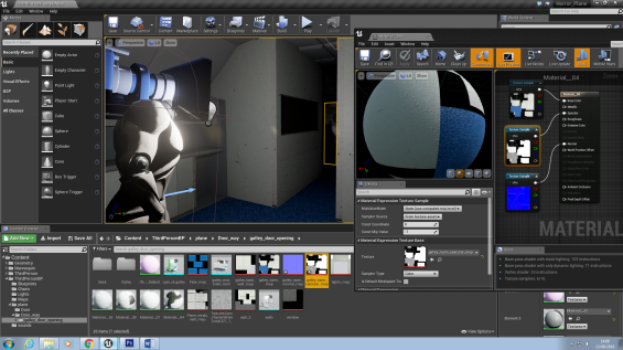
The first thing that I wanted to do was add some secular and normal maps to my texture to really make the environment jump out at the player and make the environment look spooky and fit the horror theme, because so far without these mapping it looks rather plane and it doesn’t have that element of fear that I would like to implement within my 3D environment.

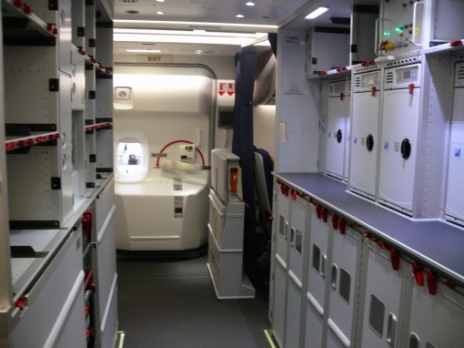
As you can see I have added the mappings to the starting points floors, walls and the ceiling to make it really pop and look good to the players that play the game.
The image below shows the final part of the final design of the textures that are going to be used within the start of the 3D environment. There was a few issues with the texturing of the walls, I tried to add blood stains that will go down and along the walls and the floor to put more of an impact to the whole horror feeling that I would like to have put forward. However, this came with an issue seeing that the original asset that I had gone missing and I was unable to find the asset so I couldn’t add any blood stains to the original asset and its textures.

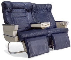
The original textures for the planes over hanging storage areas was simple and very bland at the start and to me it looked much too clean and I wants the “blood stains” on the front door to pop out more and make the rest of the plastic texture look more rustic and old, rather than it looking all clean as pristine.
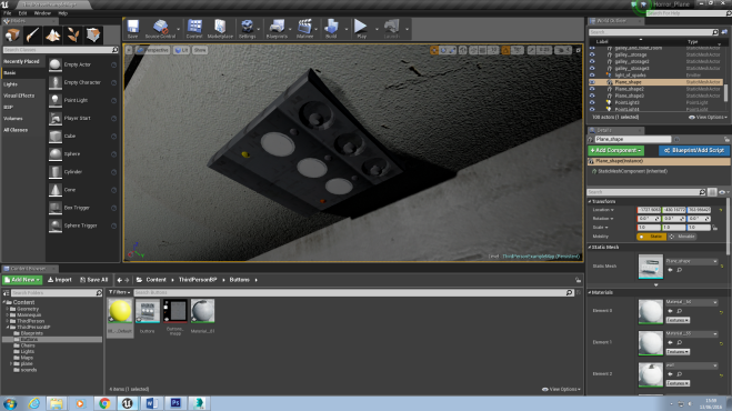
As you can see that as I have added the normal map to the containers its made it look older as wells as more engraved than before. After some discussion and peer feed back of what they though that should be included to make the 3D environment become perfect they suggested that “The compartments look too stone like and it looks more like concrete rather than looking like plastic”.

I have looked into this and they did so I took down the number of lumps that were given to the normal map of the compartments to take away some of this stone like texture. Bringing this down has really changed what the containers look like on the over hang by making the normal map less in depth and bumpy as before it has made it look more like a plastic rather than stone. 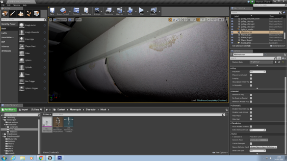

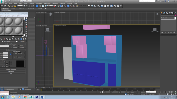
Here I have created some of the over head devices that are within planes that call for someone, on lights and gives off air conditioning to the passengers below, I though that creating this would be a good thing because it could emit light on to a possible character that is going to be placed within a deconstruct-able chair that upon the player walking on this trigger box, the light will blow, the character would disappear and the chair will “explode”.
This is the reason why I have textured one of the lights differently to the other one so one looks as if it is on and the other one is off.
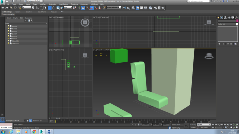
Upon the importing I noticed that the area and place that it needed to go as well as where id like it to go, it was far too big to fit within the place because it was was too big to fit it in the area. Also as you can see from the image half of the model is “floating” off of the model is supposed to be within and this is a huge problem.
To resolve this problem I went back into 3DS MAX to edit the initial size of the asset as well as adding on a backboard to take away that gap that wasn’t needed or intended.

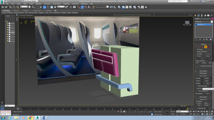
As you can see after some alterations it is fitting nice and snug as well as not having the gap above the asset as well makes a big difference due to the lighting bounce as well as having any light go over the top of it which would make it seem un-immersive.
Evaluation
This week has gone rather well and my plane interior is finally coming together and it is starting to get the whole scare factor that I was hoping that it would entail. I have added all of the specular and normal maps to the assets. I have added a few tweaks to the positioning of some of the assets as well as size and shape to make them seem more fitting.
Adding the final touches to the plane really went well and they look sharp and defined and they really give a sense of decomposing of the plastic.
HEY!: justincase1021. “HEY!” Free sound FX. justincase1021, January 21st, 2010. Web. 21/05/16.


Recent Comments